FINAL DRAWINGS
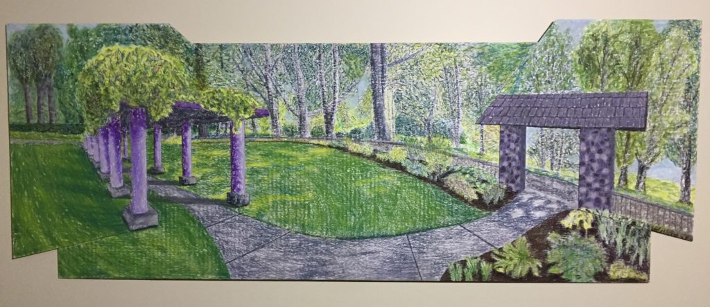
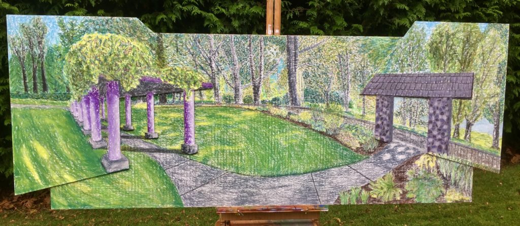
Presented at critique.
210 Assignment #1 Statement
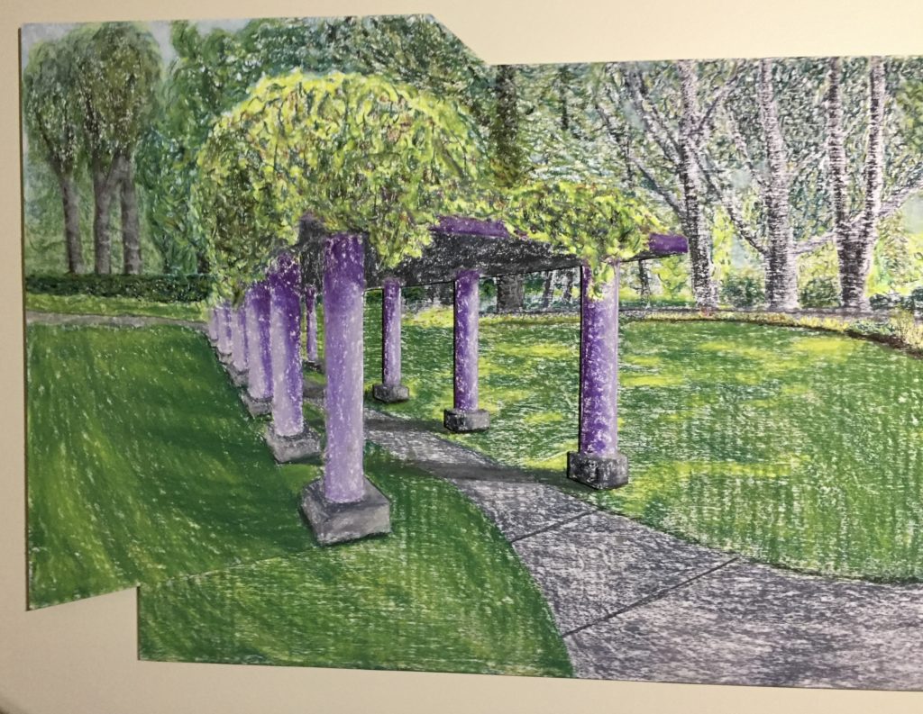
Filberg Park stands out for me as a gathering place for events both public and private. Over the years, I have attended a number of concerts and fairs there, but also a surprising number of picture-taking sessions. During one such recent session, I was struck by the classical look of the colonnade in the upper park and how much it seemed to suit so many of the events and gatherings that go on in the park. The colonnade has a weight and magnitude about it that impress. But for the wood it is built of, it looks and feels like it will last forever. This structure has been and will continue to be witness to the myriad people who visit the park.
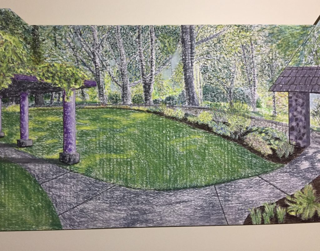
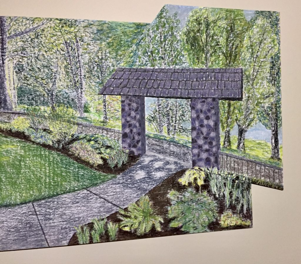
As I sketched gesture drawings of the upper park, it was hard not to give the colonnade a position of prominence. Its columns felt as weighty and solid as the many old trees in the park, while the opportunities to put one’s perspective skills to the test were many. However, as I went to draw down near the stone arch, I was struck by the sweeping curve of the sidewalk between the arch and colonnade, and that of the fence and garden that swept between them in the opposite arc. My eye travelled around and around the oval of those two arcs and it seemed natural to make this the subject of my final drawing.
My intent in drawing this was to separate the architecture of the site from the natural elements that surround it, yet emphasizing the harmony that exists between the two. I wanted to give the colonnade in particular a classical feel, which I felt was appropriate for the enduring variety of events that occur in and around it. Thus, I presented it as being more refined than it actually is and in violet hues that are not found elsewhere in the drawing. The rustic stone arch fits less well with this theme, but it has as much of an enduring quality and it was too important a part of my drawing not to include it.
The rough texture of the background plywood presented a very different surface for drawing with chalk pastel than did the Stonehenge paper I had originally intended to use. Thus, I decided to create separate drawings of each of the architectural pieces and have them stand out by gluing them to thinner pieces of plywood. These I then glued onto the natural background.
Similar to the continuing sense of place and community that the Greeks and Romans must have felt amid their architectural accomplishments, my goal was to represent the enduring quality of the architecture of the upper park in the context of the natural beauty of the setting. As with the many people who travel around this park, I wanted the viewer’s eye to wander about the drawing and the viewer to feel a welcome part of this picture.
ARTIST RESEARCH
