ARTIST RESEARCH – Simon Evans (and Sarah Lannan)
“Everything I Have”, 2008. (60″ x 40″)
Pen, paper, scotch tape, correction fluid and inkjet prints on paper. From: invaluable.com.

“Everything I Have”, 2008. Detail.
From: reflag.org.

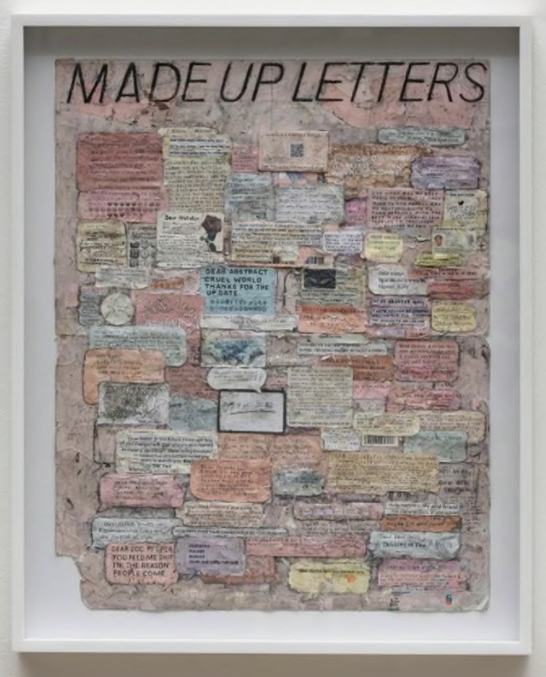
“Made Up Letters”, 2018. (28″ x 22″)
Paper, pen and tape on paper. From: artbasel.com.
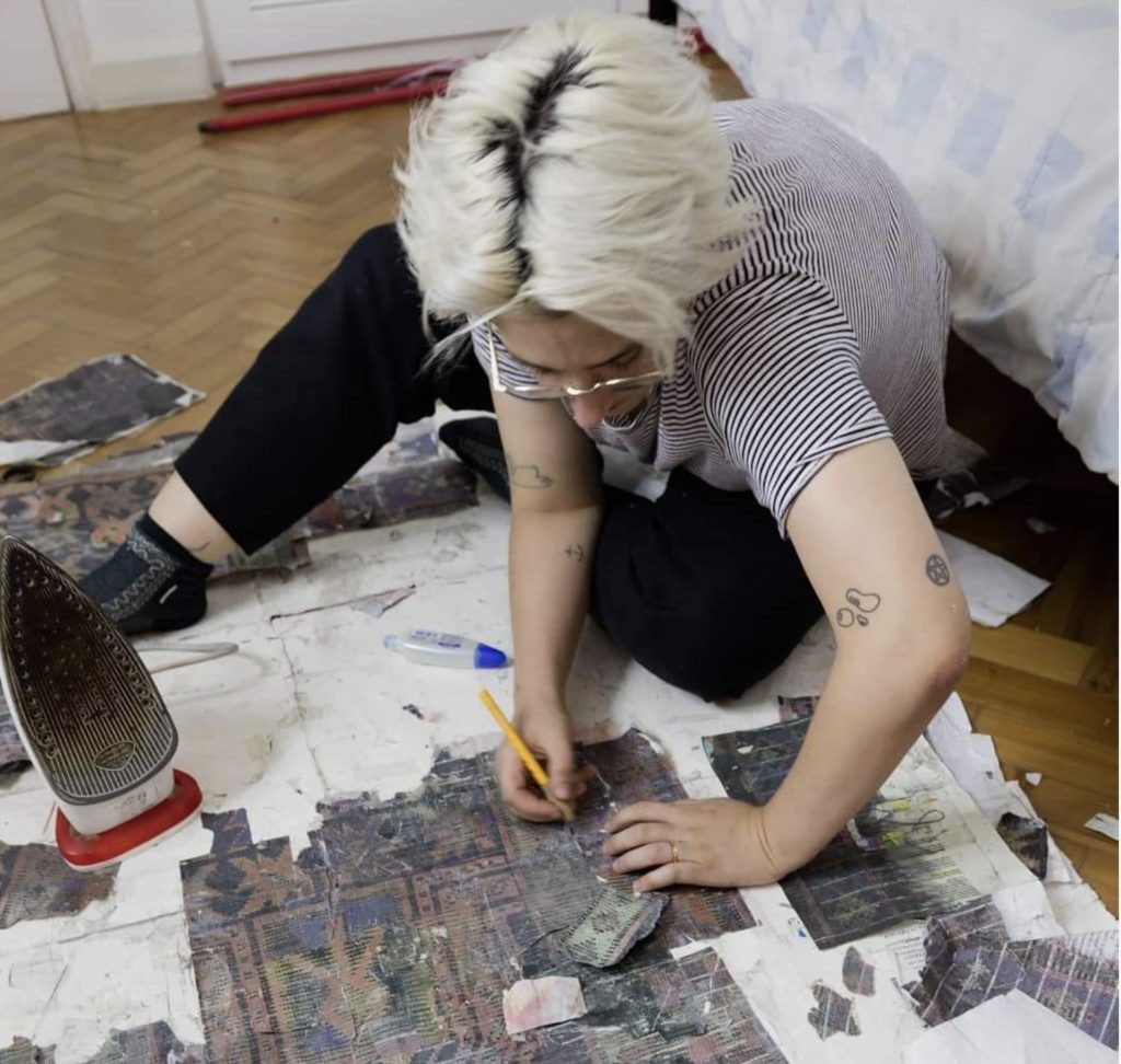
Sarah Lannan (left) and Simon Evans (right) at work.

Simon Evans is a 48 year old British-born artist who is best known for his ‘drawing as diagram’ type of artwork. He was a professional skateboarder and writer before becoming an artist. He began to exhibit his work in 2003.
Evans uses diagrams, maps, charts, advertisements, diary entries, inventories and cosmologies to present his works. They tend to be text-based works, often collaged, and present collections of ideas, phrases, drawing and images. His intention is to portray his perception of the state of contemporary society, commenting on its inequities and inadequacies, but also seeing the humour and irony in that same world. There are recurring themes of, for example, religion, mindfulness and consumerism, but they are always presented with a witty sense of humour.
Viewing Evan’s work was difficult on the computer because of the small size of the pieces that make up most of his artwork. You can appreciate what he is trying to say in an individual piece from a distance, much like viewing a painting, but I really wanted to get right up close and examine the detail in the pieces. There is an earnestness and almost a naiveness in the amount of detail in his works, as if each scrap is revealing something personal about him. At the same time his works are very tongue-in-cheek and offhand, and its hard not to experience these two feelings as you view his works.
Most of Evan’s pieces are done in large format of, say, several feet by several feet. They are generally extremely dense and highly detailed. The two principal components of his works are scotch tape and bits of text that he has either collected or printed himself. You will also find multiple scraps of paper from various aspects of daily life, pieces of foil, wrappers, pencil shavings, pieces of advertisements and many handwritten notes. It’s as if he is trying to make sense of the world and his place in it, and reassure himself that everything is going to be okay.
A talk about Simon Evans would not be complete without mentioning the idea of art by collaboration. In 2006, Evans met Sarah Lannan, a commercial illustrator. They became a couple and she began to help him with these very labour-intensive artworks. They married in 2011 and are described as having an “intense, deep connection” and operating “as one being”. However, in a 2014 WSJ article, Lannan suggested that it was inaccurate to credit only Evans for these works and around that time they began to acknowledge her contributions to these productions. Fast forward 6 years to 2020, and all their work is now produced under the name “Simon Evans TM”, itself perhaps a tongue-in-cheek nod to the contemporary art world. They are very cheeky and cagey in interview and don’t give straight answers to this issue of why just his name is credited. I get the feeling they thrive on the controversy, which is no doubt contributing to the success of their collaboration.
3 Artists: Wangechi Mutu, Gyula Sagi and Cy Twombly


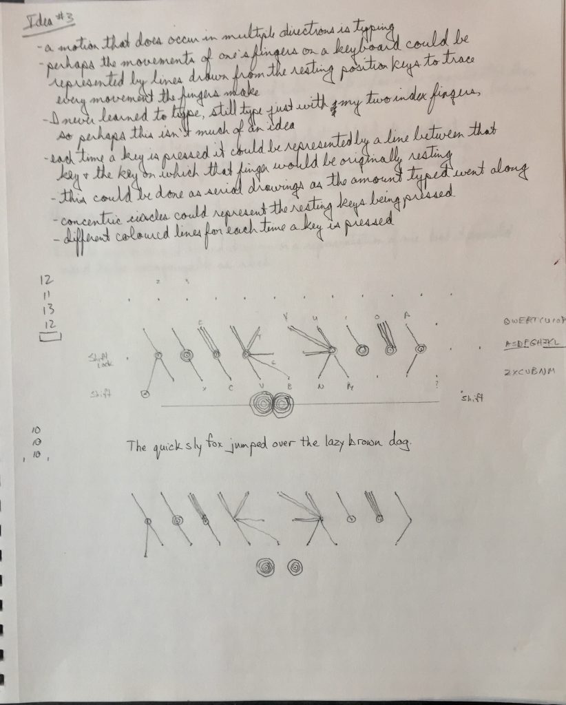
Assignment #3 Ideas
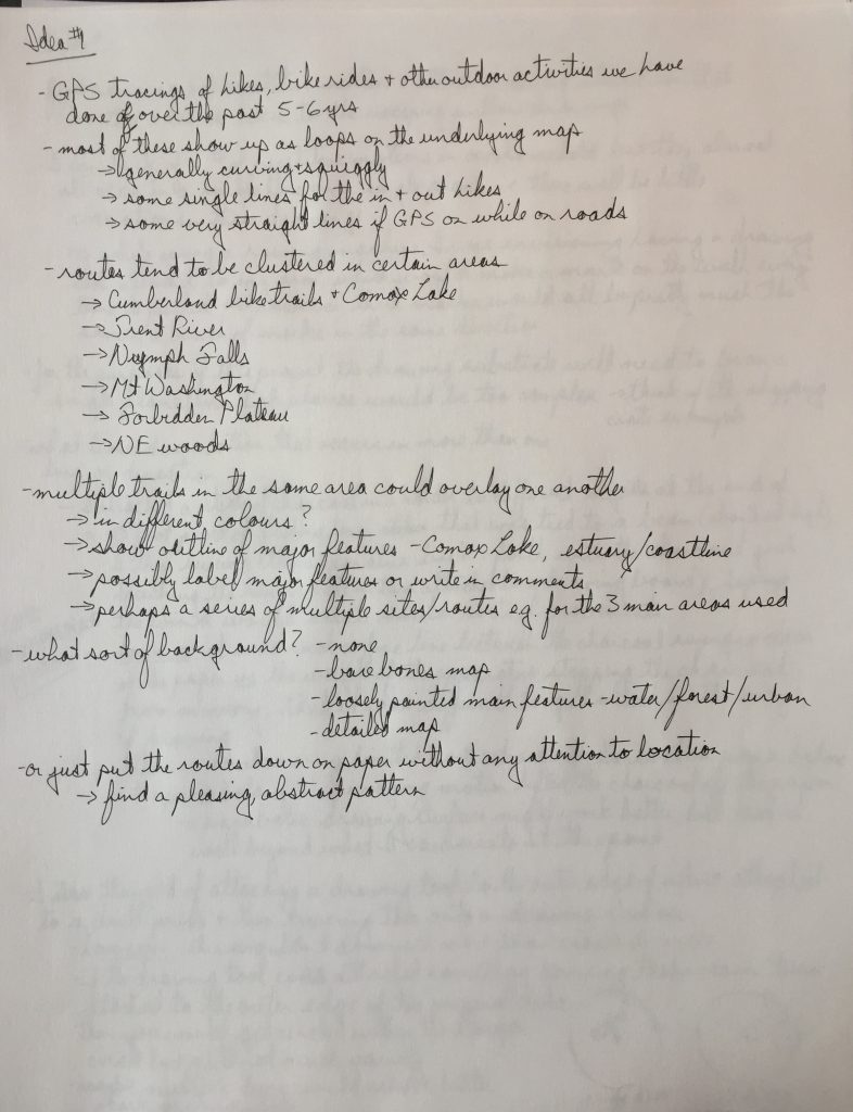
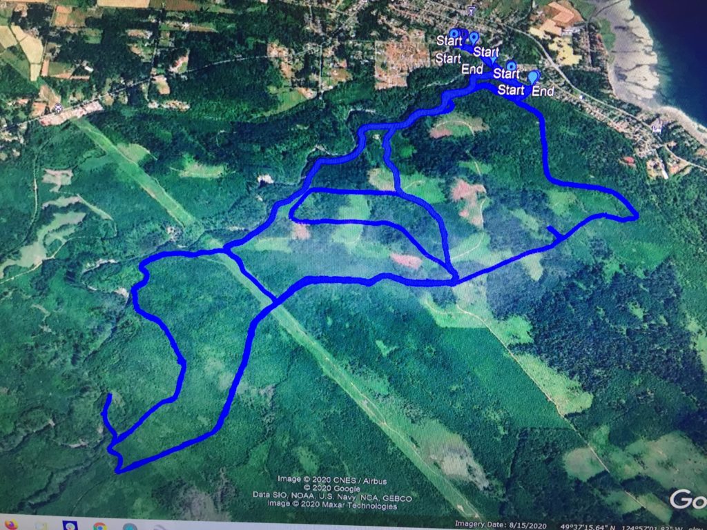
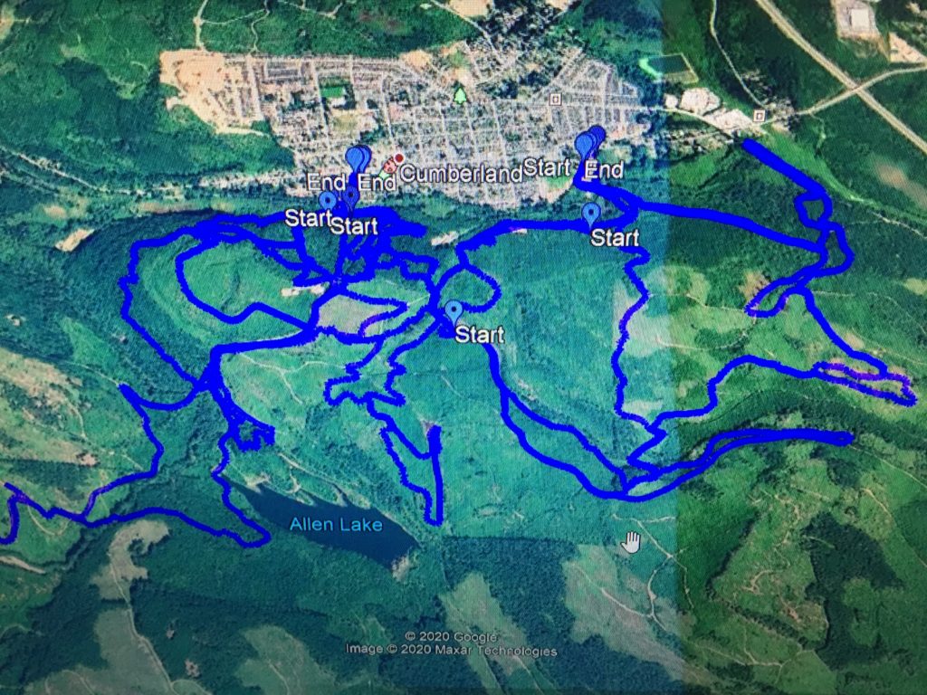
Idea #1 – GPS tracings


Idea #2 – Repetitive motion
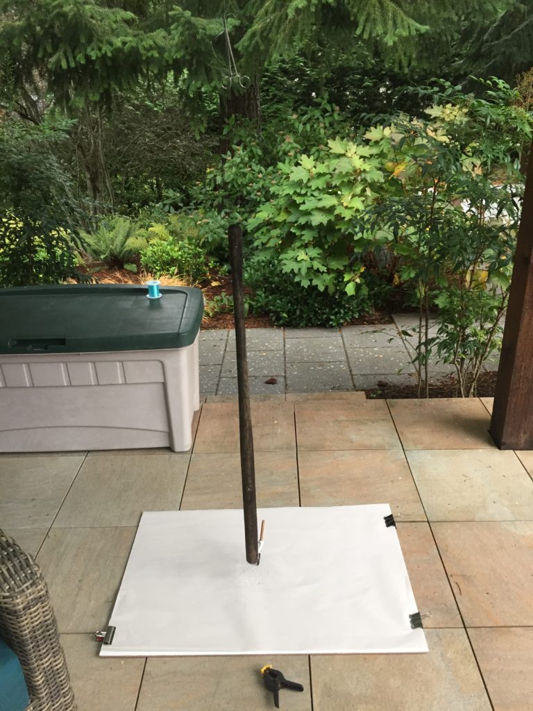

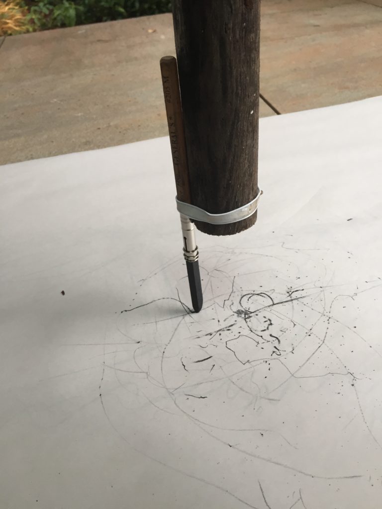
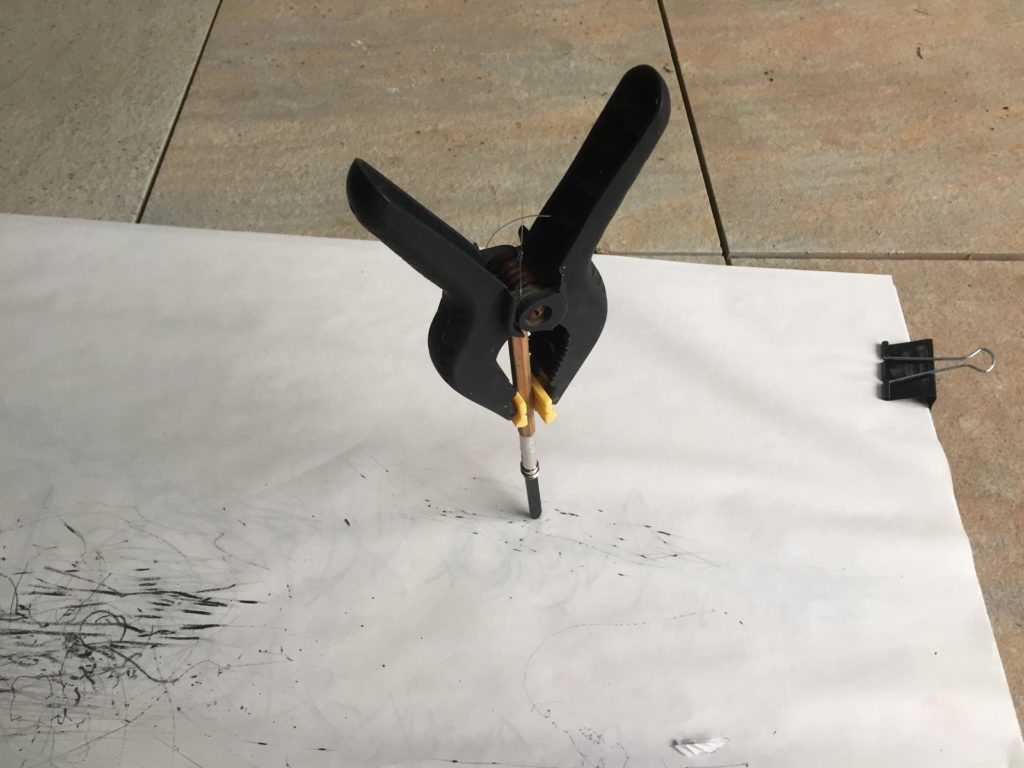
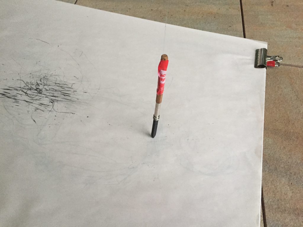
Idea #2B
Idea #3 – Hanging clear plastic in a window, trace the viewed objects with marker on the plastic from a variety of positions. I was hoping there would be distortion and overlap of objects from their different viewpoints, but the effect didn’t amount to much.
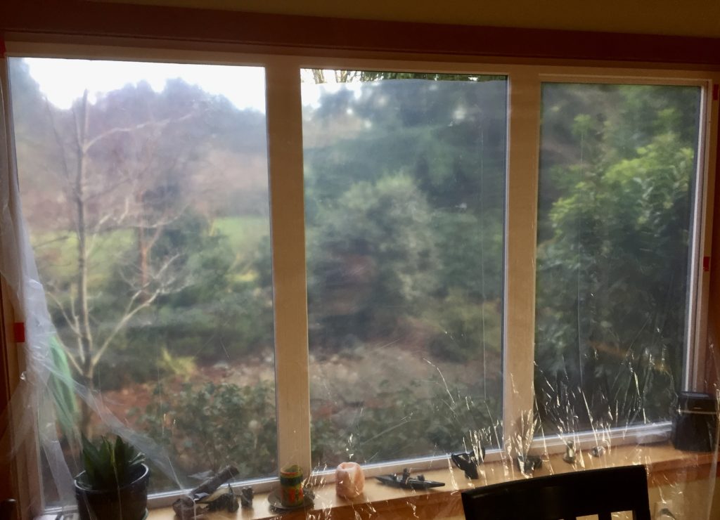
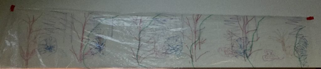
Drawing of about 10 trees and shrubs from 5 different positions in front of the window. 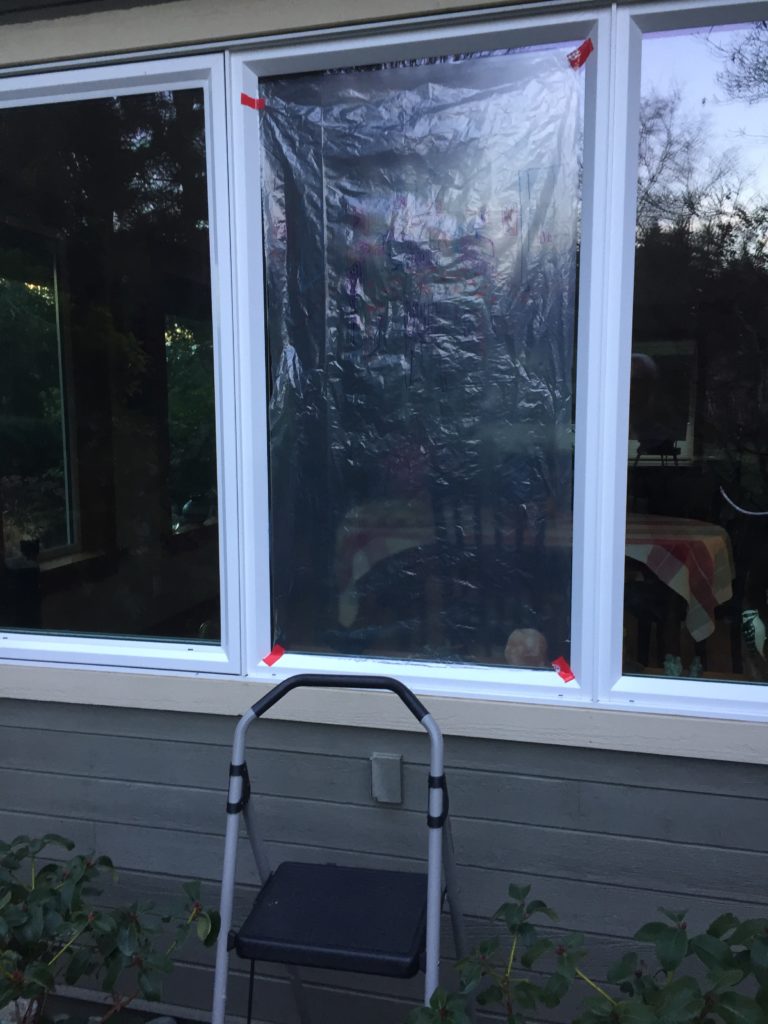
I then hung plastic outside the house and traced the interior view, much like Albrecht Durer’s woodcut of a draughtsman practising foreshortening. A fun exercise, but as an alternative form of mark making it didn’t accomplish much. 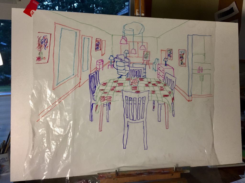
Idea #4 – Drawing as diagram
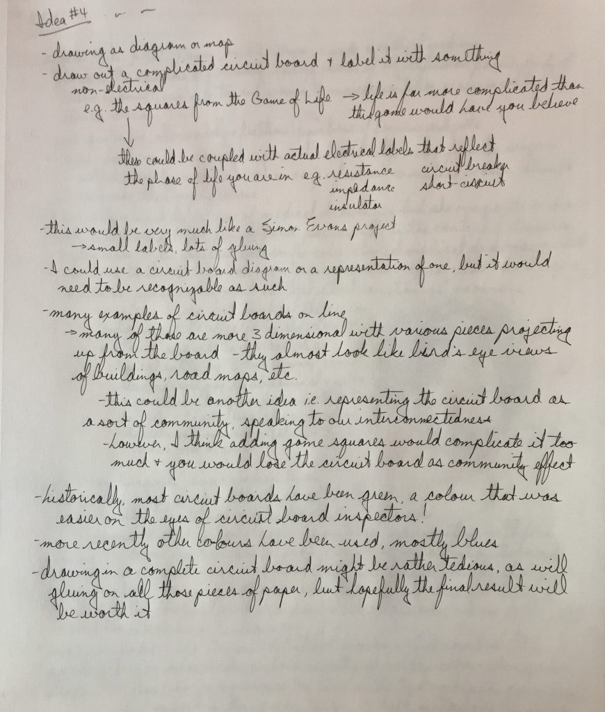
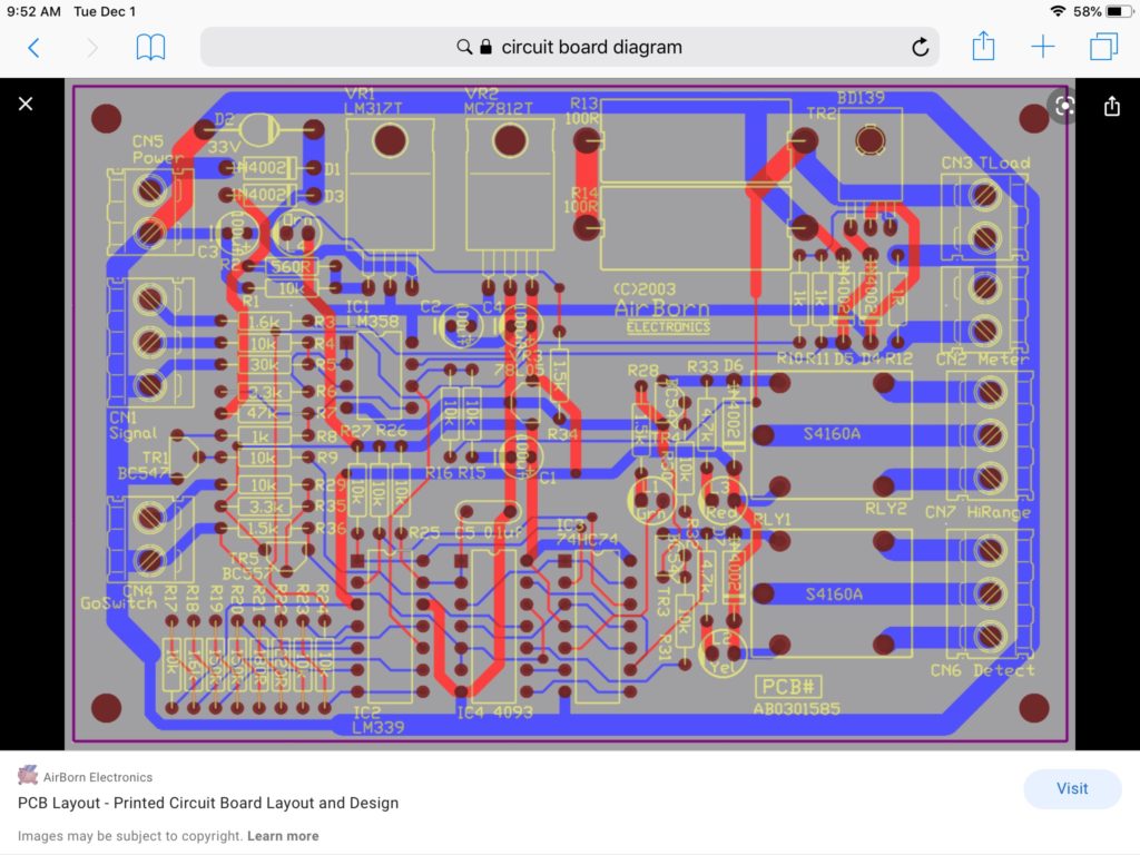

The above two images were of 2 dimensional circuit boards that caught my eye. I was looking for something that would be aesthetically pleasing, especially with many labels of different colours glued to it. I didn’t think the standard green colour would work too well, so I chose the blue in the second image here, which matched well with the phthalo blue acrylic paint I had. I bought silver and gold metallic Sharpie permanent markers, which went on the painted canvas very well. I copied the first few lines of my circuit board from the image above, but after that I could see different ways in which to create patterns and how to lay the angled lines down along side each other. Not much different than doing a jigsaw puzzle. As long as I avoided being too repetitive, it ended up making a nice looking circuit board replica. I made a plywood template with a 135 degree angle to draw most of the angled lines. I punched holes in an old plastic card as a template for the gold circles.


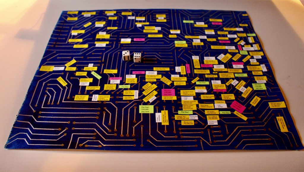
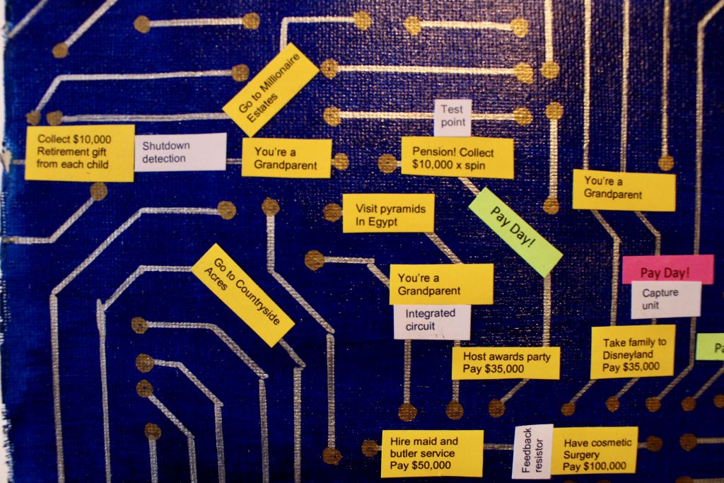
Title: “Flow Chart”, 2020, (16″ x 20″). Cardstock, glue, acrylic paint, and permanent Sharpie marker on canvas.
My intention with this piece was to create a diagram with labelling that would mimic a board game, in this case ‘The Game of Life’. However, I wanted to portray my perspective on how complicated and unpredictable the twists and turns of life are at various stages of one’s life. I chose a circuit board to represent the framework and potential pathways life can follow, the circuit board being infinitely more complicated than the simple path of ‘The Game of Life’. The route starts in the upper left and moves across to the upper right for one’s 20s and 30s, before turning down into the 40s and 50s, and back across to one’s 60s at the left side of the board again. The yellow squares are based on the life choices and events one faces, the Pay Day squares are in pink and green, and the white terminology squares are meant to be comments, puns or double entendres relating to the other squares they abut.
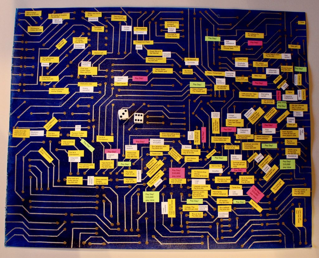
This is a difficult piece to appreciate without being able to get right up to it and see the flow and overall trends. I could have done something to the background to make the overall path more evident. I didn’t personalize this, as I wanted it to be recognizable as ‘The Game of Life’. However, I could have made the yellow squares more humorous and current, getting away from the more naive content of the actual board game. I think that would have improved the viewer’s experience and made it more interesting.
Upper left detail (below)

Upper right detail

Bottom right detail

Bottom right close-up

Bottom left close-up