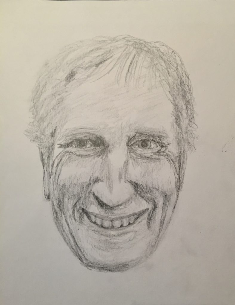
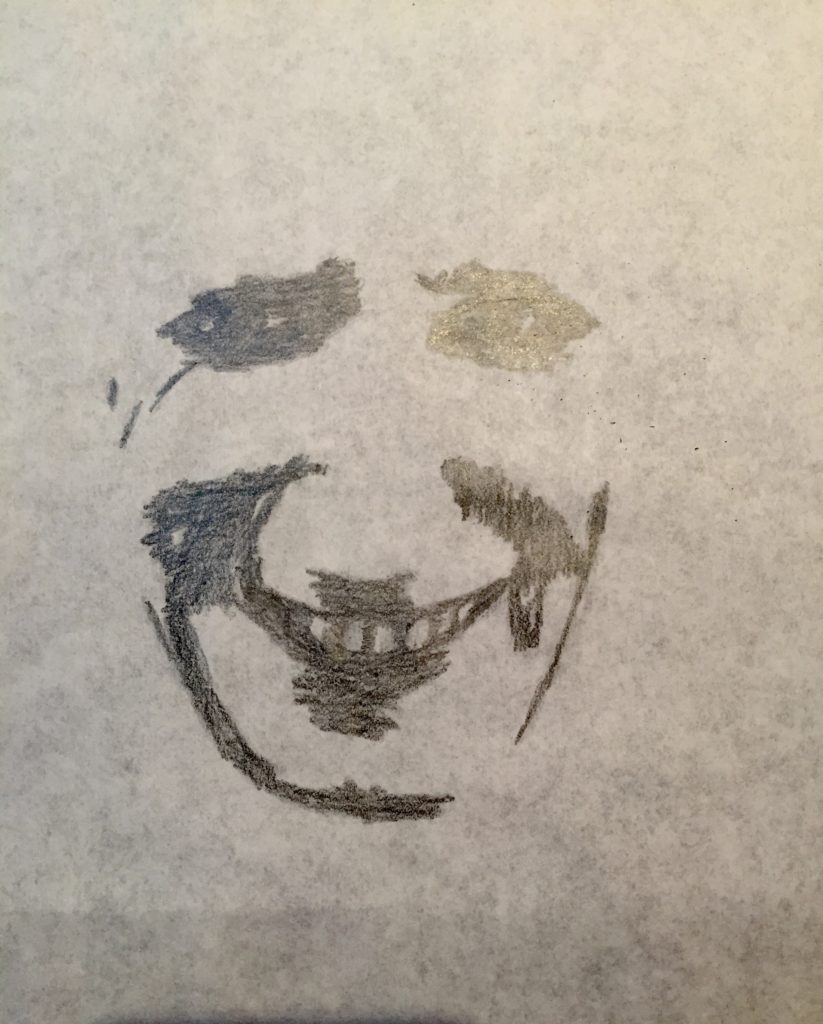
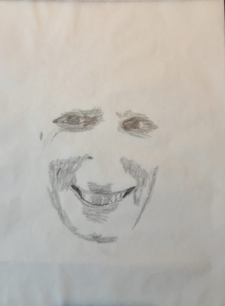
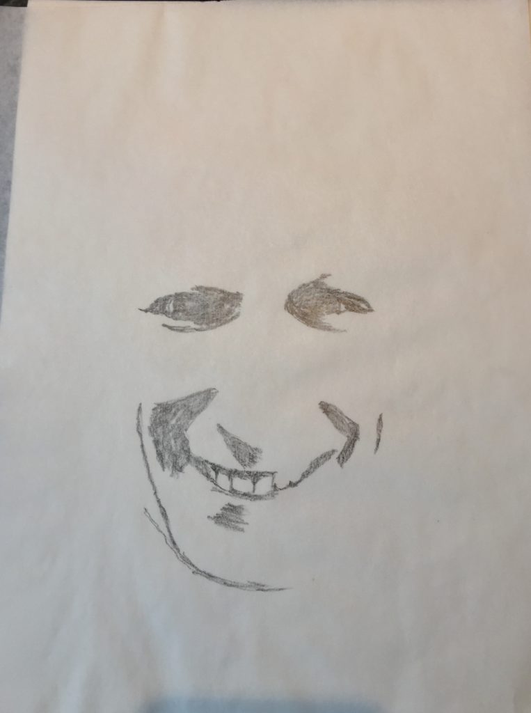
Idea #1: Value changes and variations within a portrait
My plan here was to take a self-portrait and reproduce it with varying degrees of two or three value adjustments. I have always been amazed how artists convey a likeness of a representational portrait sometimes with such limited amounts of shadow/silhouette. I was hoping this would lead to some degree of abstraction, but it really didn’t end up doing that. Even with the limited amount of shadow in the last drawing, it is still recognizable as me. At least it is to me!
I suppose I could have fragmented these drawings and rearranged them, but that was not my intent in this exercise.
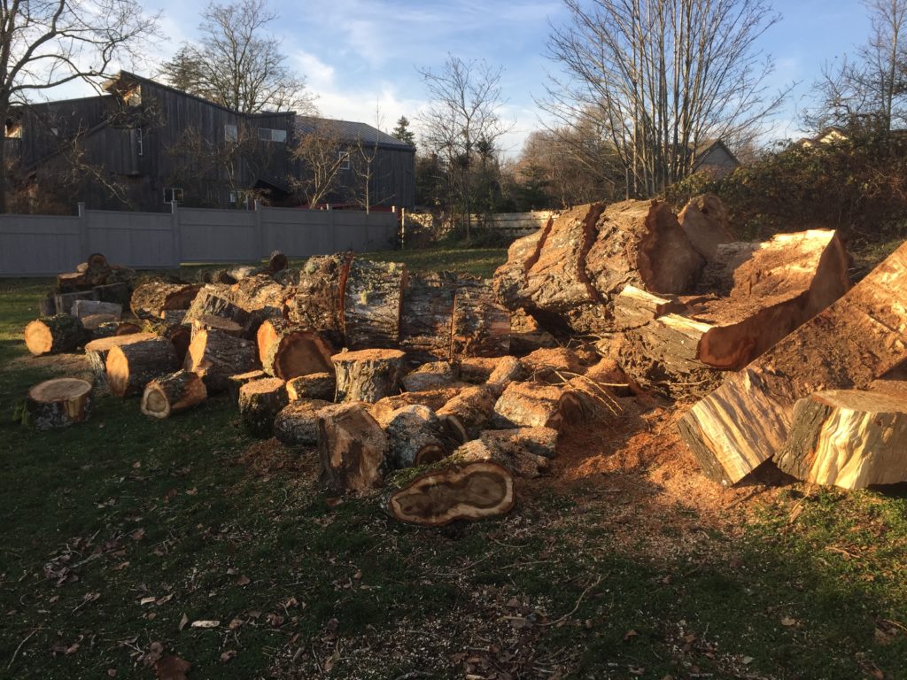
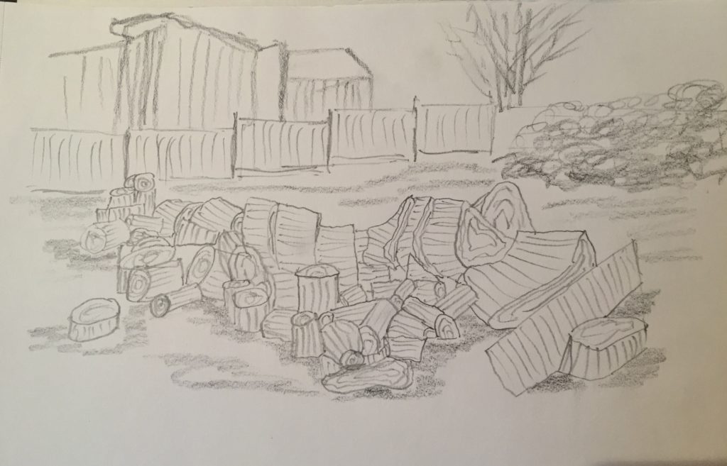
Idea #2: This was a felled and sawn tree that struck me as being full of all sorts of abstract shapes. It also had the advantage of two components to the wood, either the cut, round cross-sectional surfaces or the bark-covered, outer surfaces.
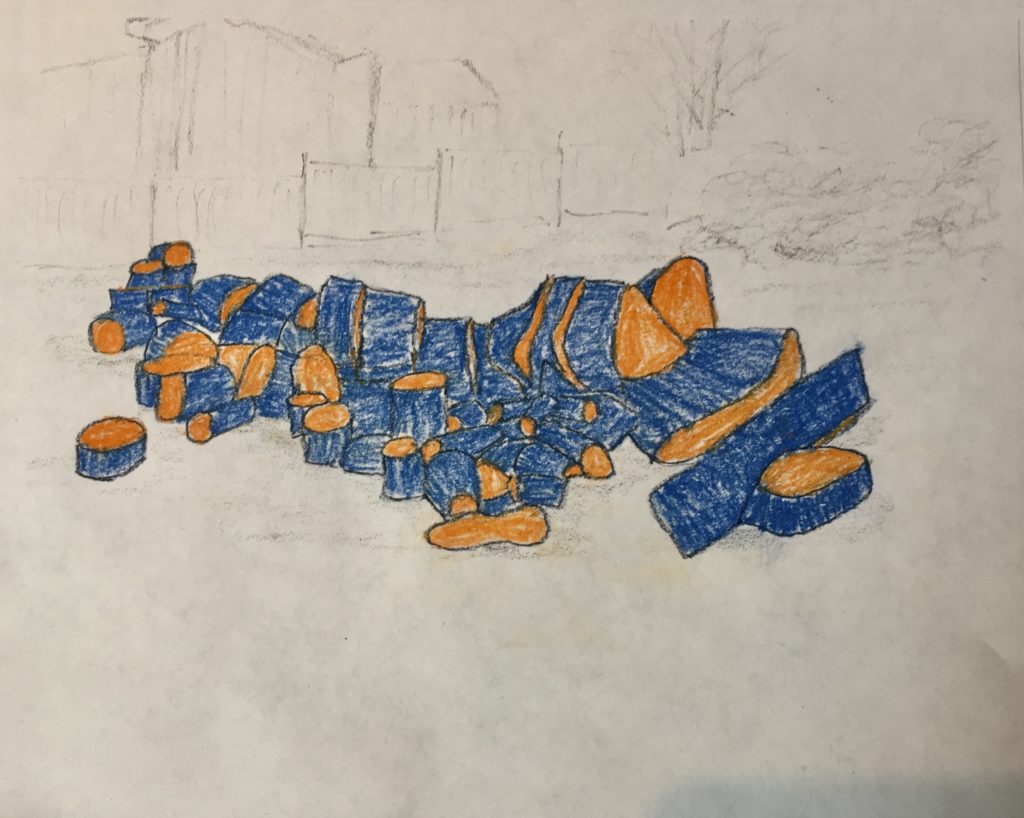
Drawn with cut surfaces in orange and bark surfaces in blue. 
Bark surfaces only. 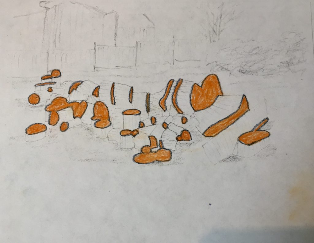
Cut surfaces only. 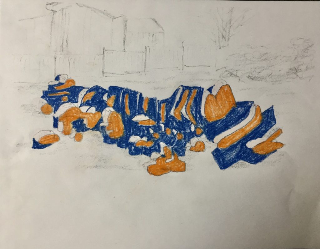
The two colours recombined, but with the orange shifted slightly to the right. 
With red filling in the spaces where the original orange had been.
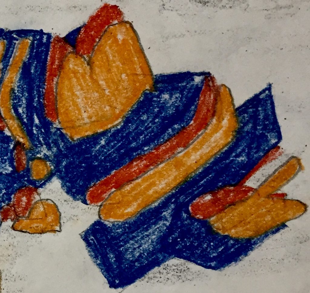
I tried using close-ups of my larger drawing. In the above image, I focussed in on the right side of the drawing. This image would not be recognizable as a felled tree on its own. I was left not really knowing though if any of these close-ups made for good abstract drawings, as I don’t think I know enough yet about the concept of abstraction. Intriguing nonetheless and something to consider for the future.
Idea #3 – Geometric/perspective drawing
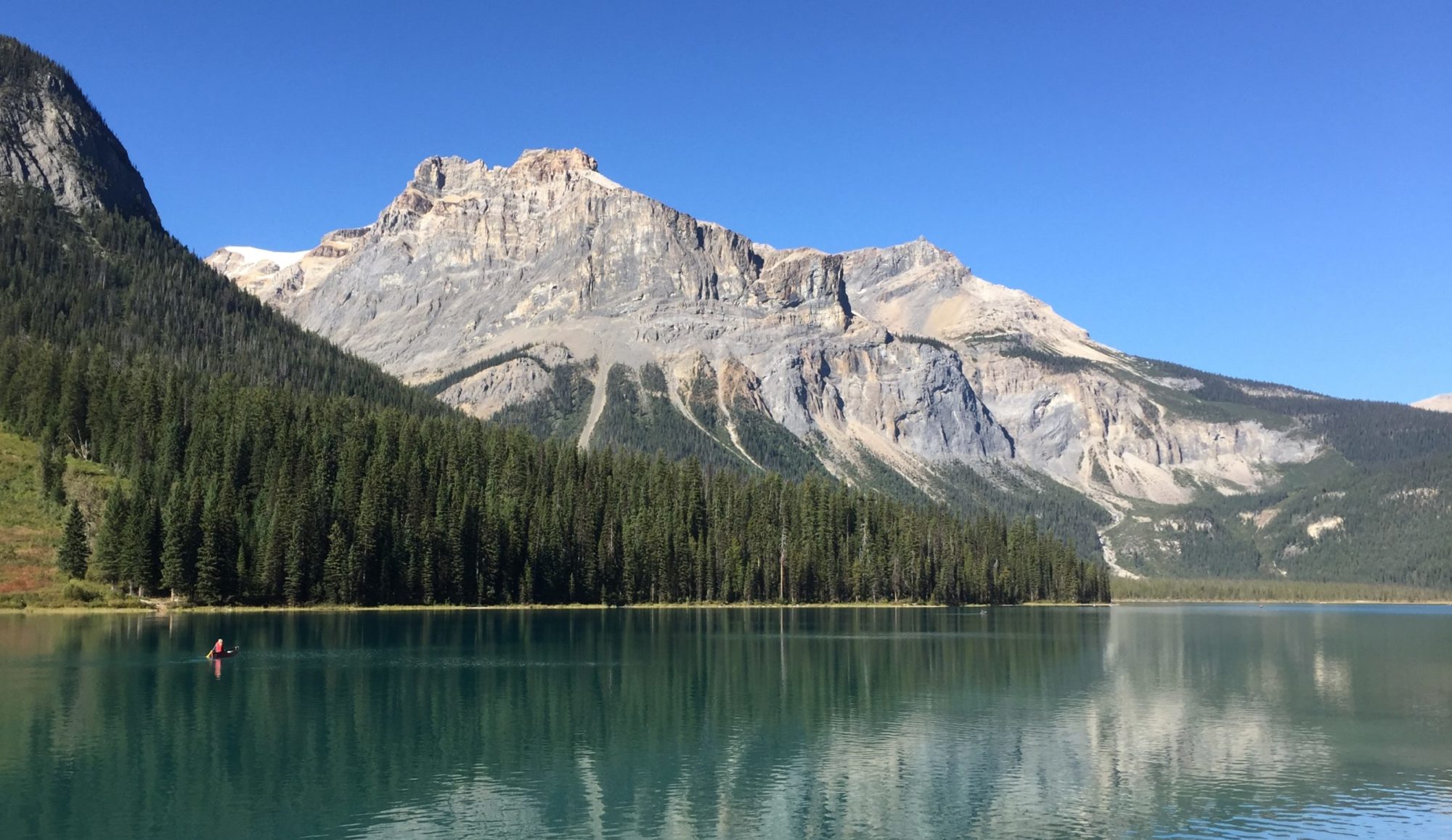
My idea here is to take a landscape scene that has strong architectural and perspective elements. I am impressed by the work of Sarah Morris and can see how she transforms such representational objects to more abstract shapes, particularly when her works have a 3 dimensional feel.
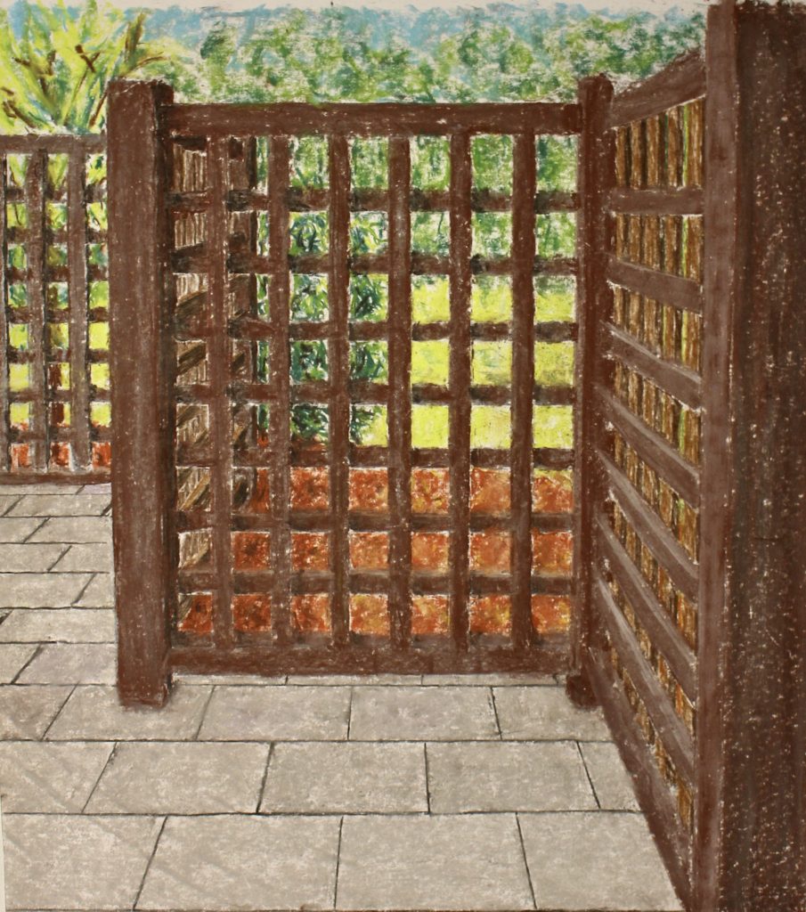
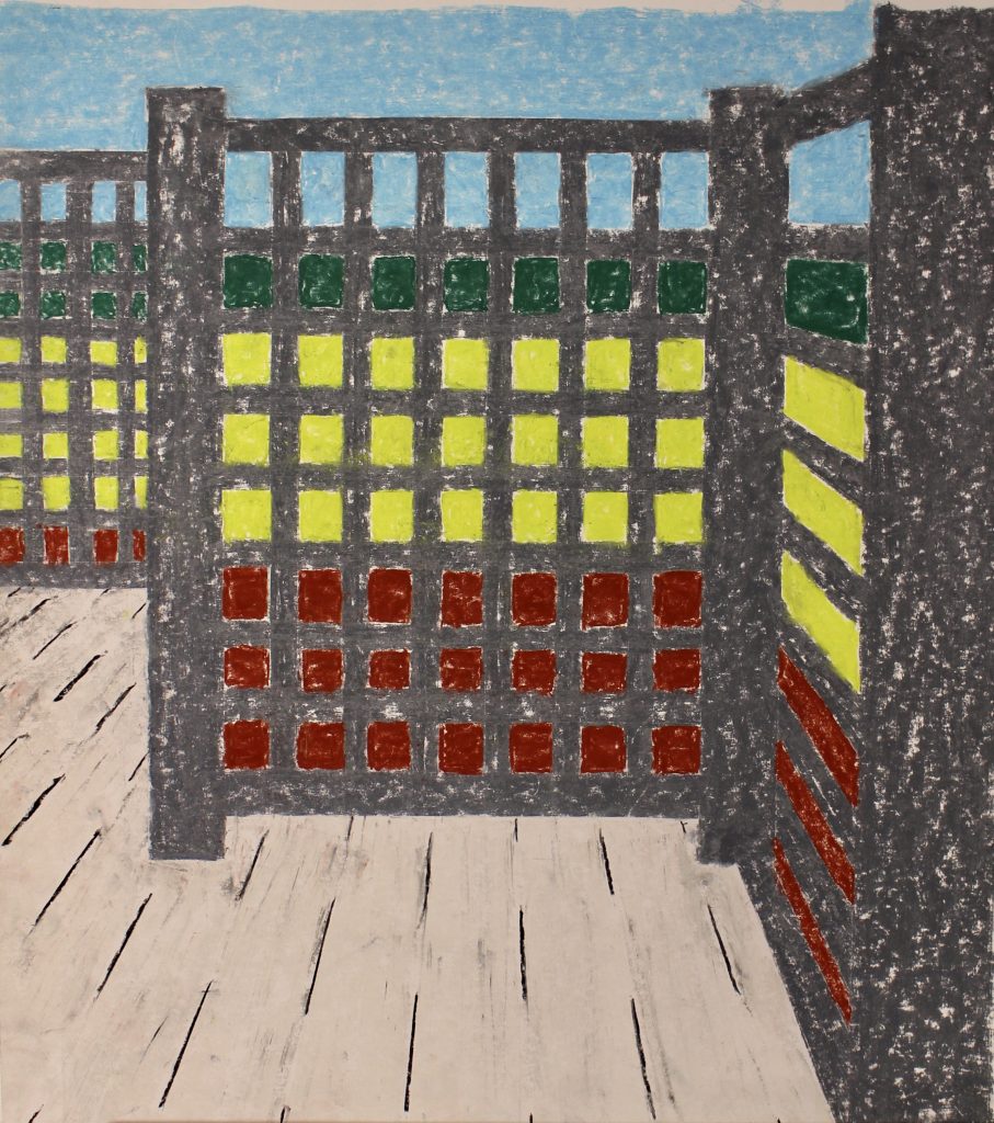
The fence panels below with the patio stones in the foreground were an obvious choice from our house. The fence panels are at right angles to each other and align with both directions of the patio stone seams. I have previously thought about how best to draw or paint this part of our yard.

This view had 4 panels in it, but it was too symmetrical for my liking. This view would have used 2 point perspective. 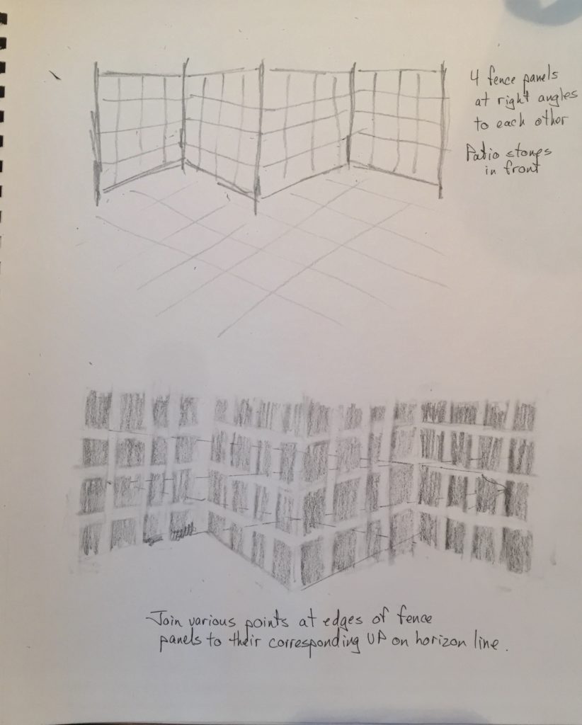
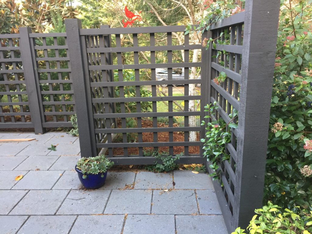
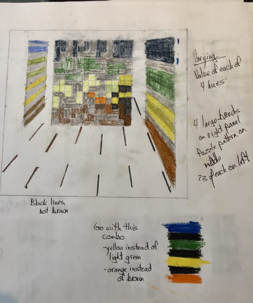
This is the view I chose in the end. It is asymmetrical and the panel pattern recedes toward the background. It uses 1 point perspective, and there are 4 bands of colour beyond the fence (including the unseen sky). 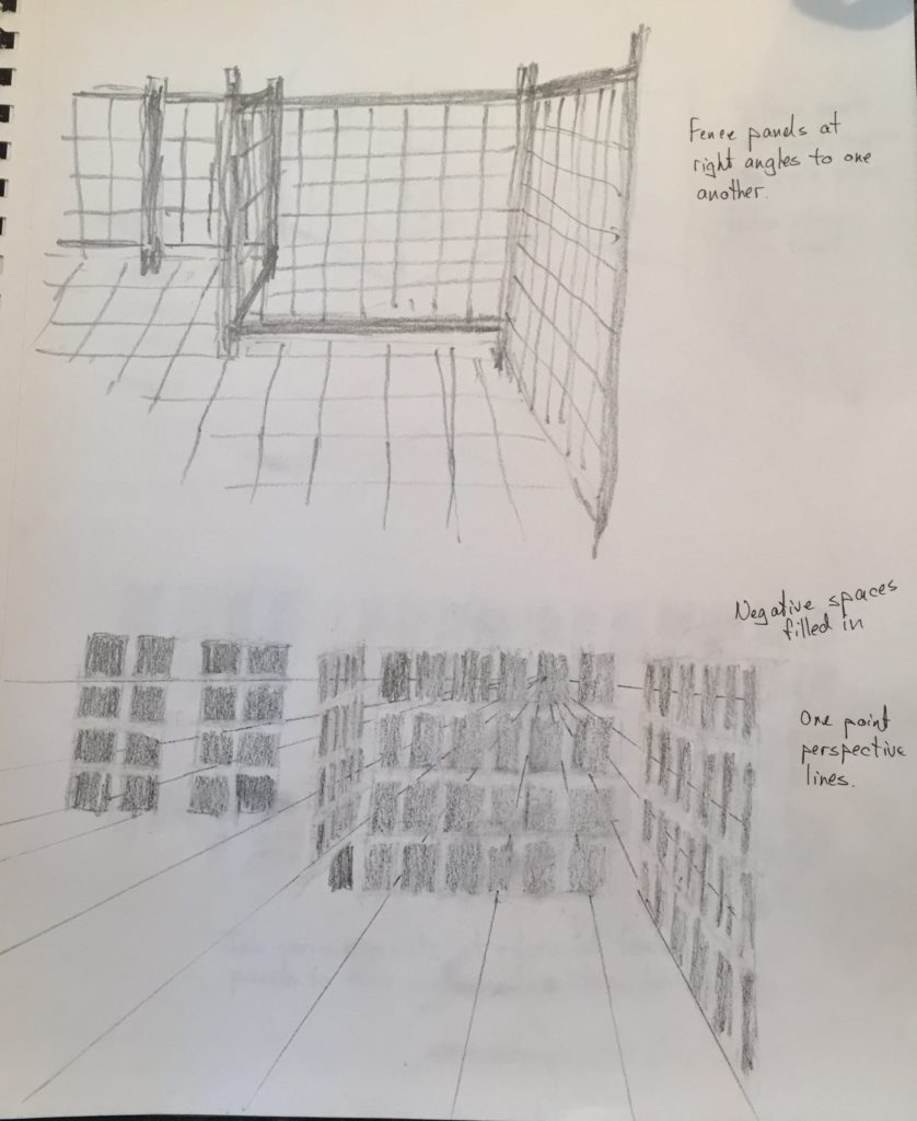
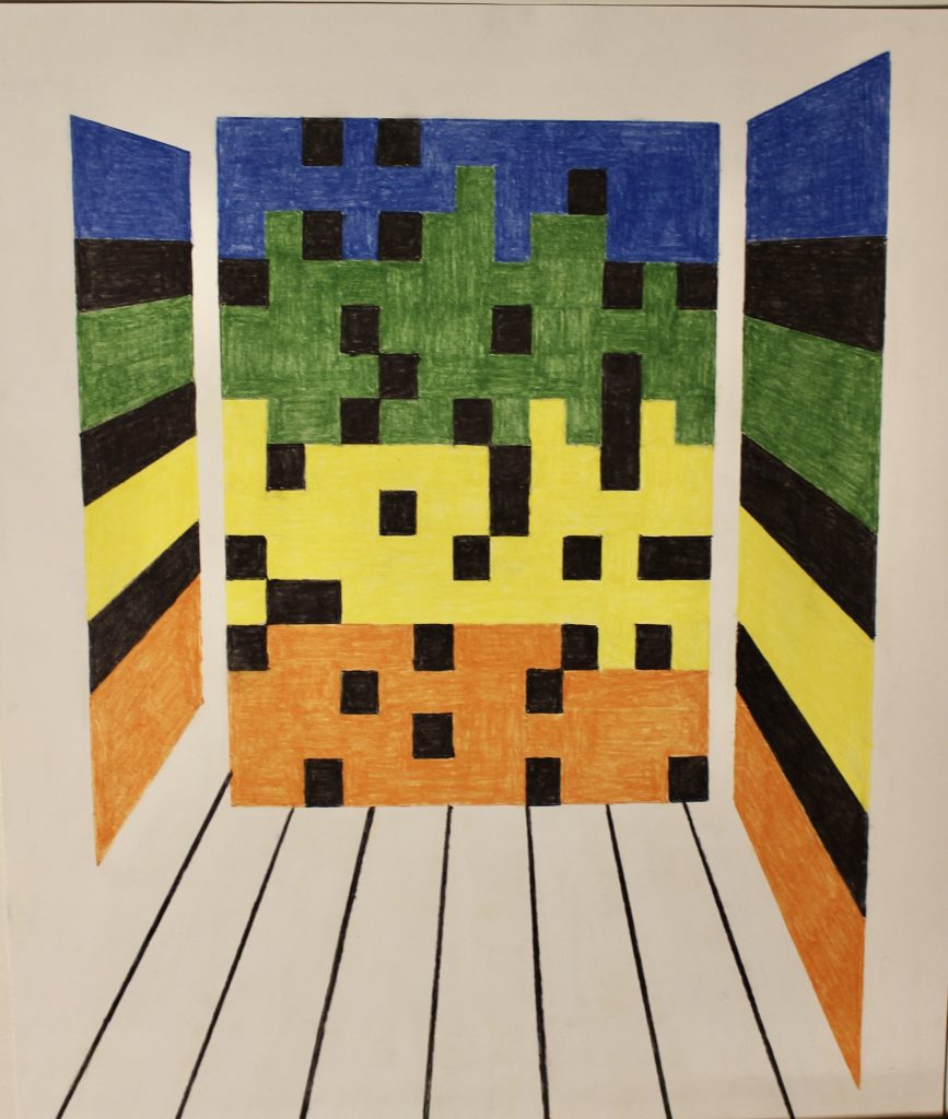
These drawings show my representational drawing above and an idea for a second drawing by focussing on the negative spaces. 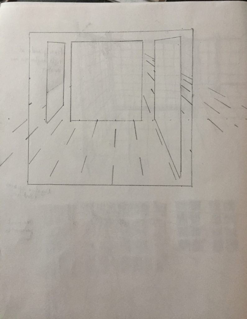
This is how I would like the panel planes to be arranged, the two side ones receding away from the picture plane. The upper lines representing the receding patio stone lines are done in the same 1 point perspective, but they bunch up too much and distract from what the lower lines accomplish. 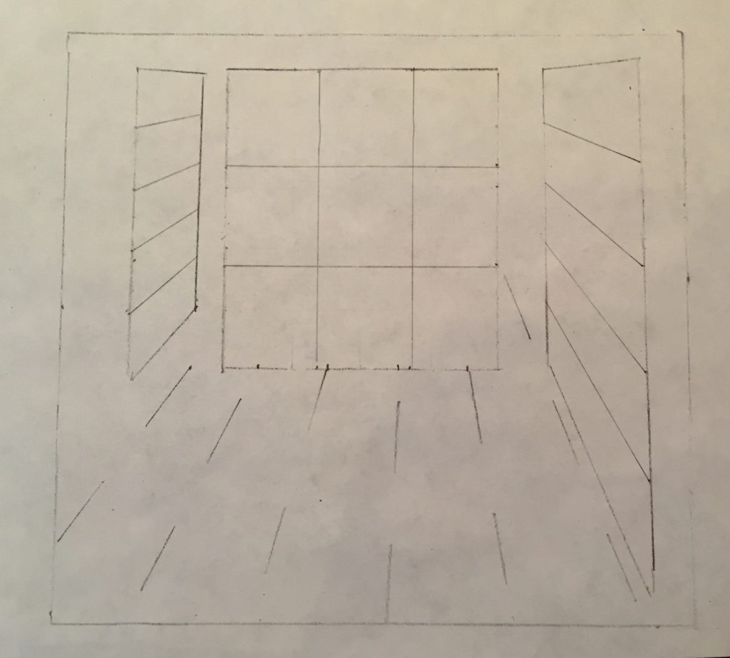
3 x 3 square pattern for middle panel
Patio stone lines all contained within limits of the 3 panels.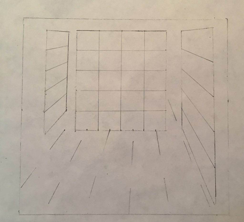
5 x 4 pattern of middle panel. This will not allow enough variation to convey the idea of the four colour bands, the chequered pattern of that panel, and the sense of it countering the movement away from the picture plane.
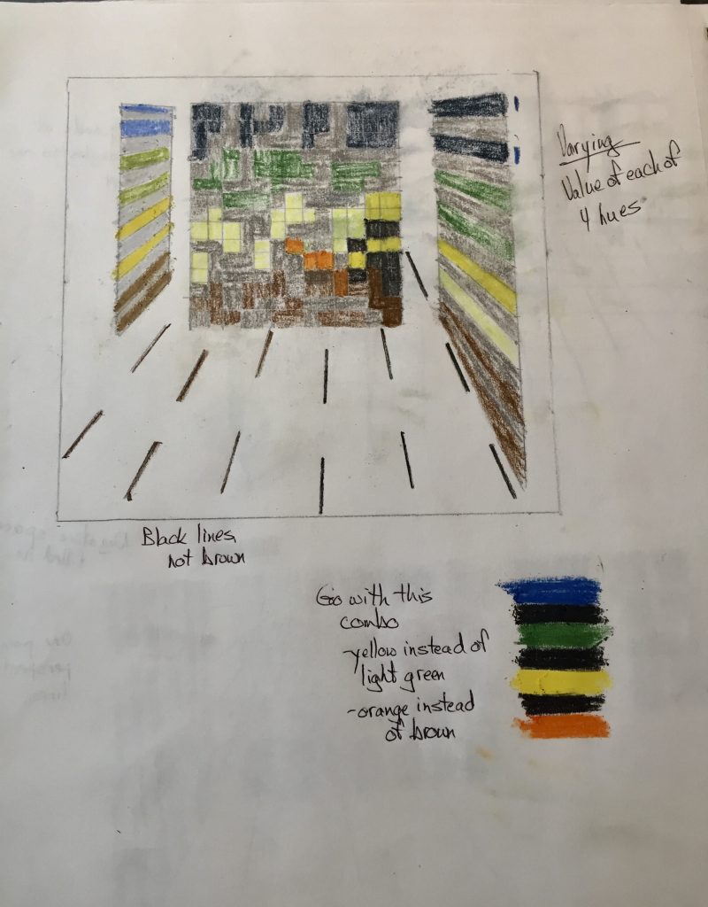
These are my plannings for colour and pattern. I want the two side panels to give the feeling of movement away from the picture plane and into the background, while the middle panel, parallel to the picture plane, sits counter to that movement. I would like it to represent a static and solid object as opposed to the dynamic movement of the side panels. I feel the roughly 15 x 15 squares of the middle panel conveyed this idea more than the much smaller number of squares I had planned earlier. I want to keep the same 4 rough colour bands of the background, but will change them to something that might be more appealing to the eye. I think I will go with the original 4 large colour bands alternating with black for the side panels, rather than the 8 I have here. I think this will better convey the sense of receding movement.
FINAL DRAWINGS:
“Fore and aft”, December, 2020.
Drawing #1: 15 1/2″ x 17 1/2″, Chalk pastel on paper
Drawing #2: 15 1/2″ x 17 1/2″, Chalk pastel on paper

Drawing #3: 15 1/2″ X 17 1/2″, Pastel pencil on paper


As a triptych.
My intention with this series was to take a landscape with strong geometric and perspective components, and transform it into something more abstract while maintaining its planar and directional elements. I originally thought I could do whatever I wanted with the colours, but as I began to simplify the second drawing it felt natural to stick with the original colour pattern and simplify the swaths of colour as well. They do represent the background. As I went along, it became apparent that the foreground paving stone lines were a subtle but important part of the directional movement of these drawings and thus they remained a part of all 3 drawings. The title, “Fore and Aft”, alludes to these foreground and background elements, while the fence planes are obvious anchors in each drawing.