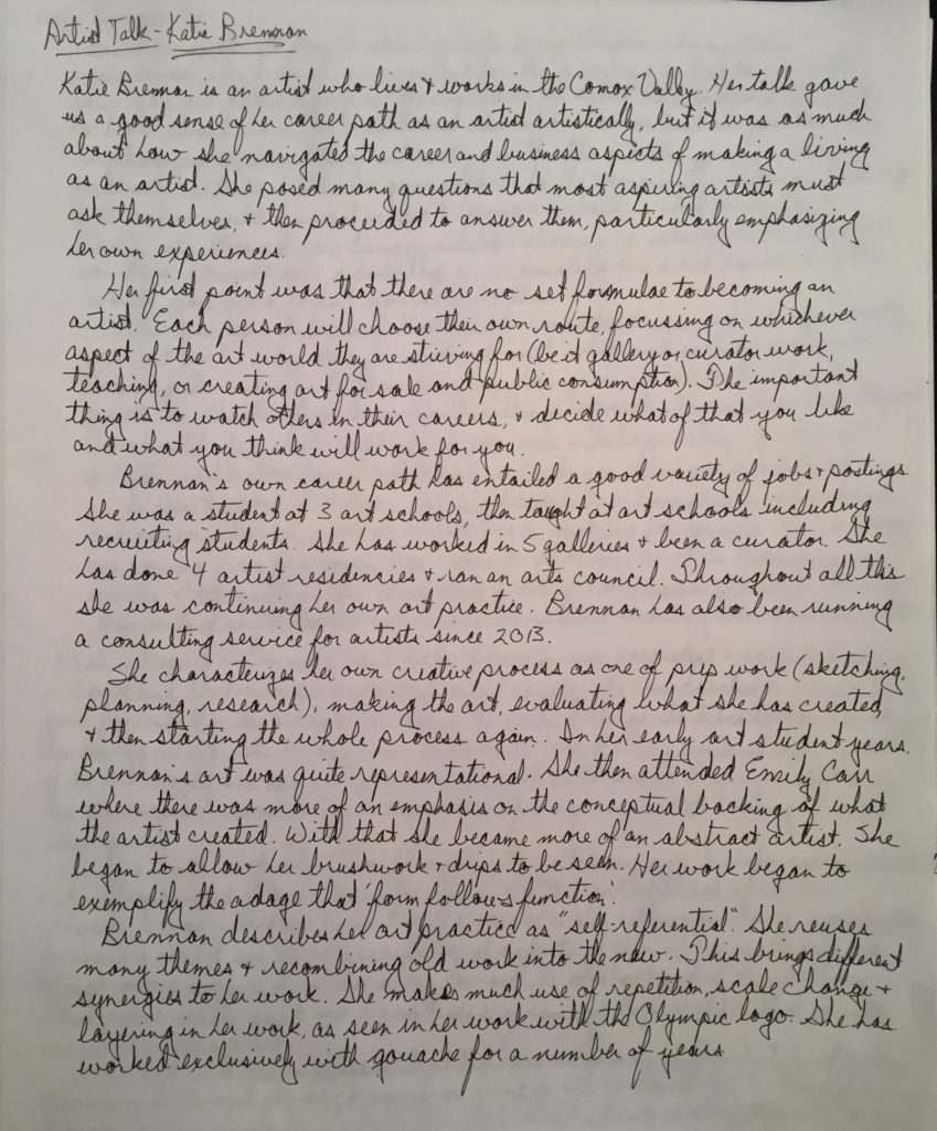
Bonus Artist Talk for FIN 210 – Katie Brennan
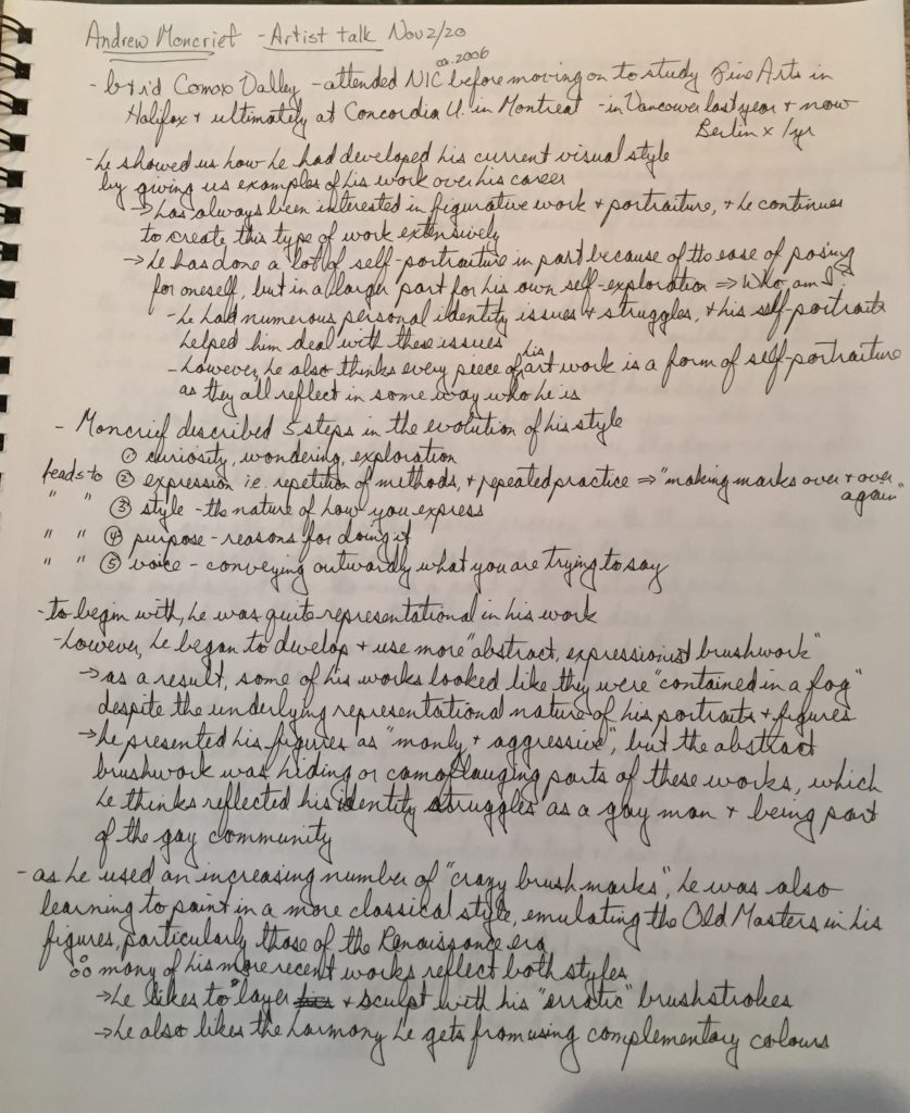
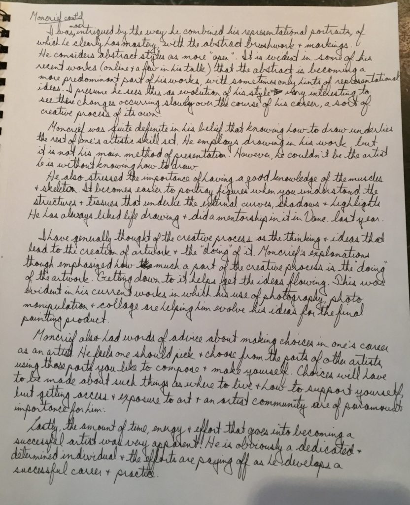
ARTIST TALK – Andrew Moncrief
Human Form and Anatomy Notes & Drawings
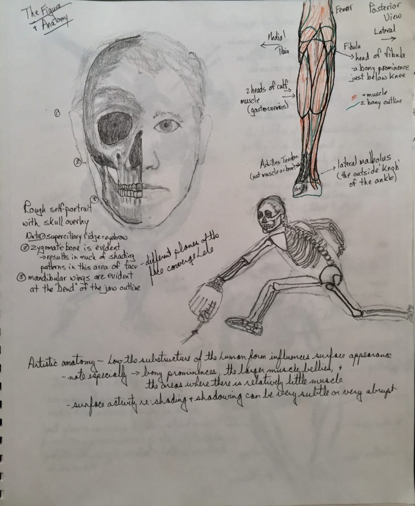
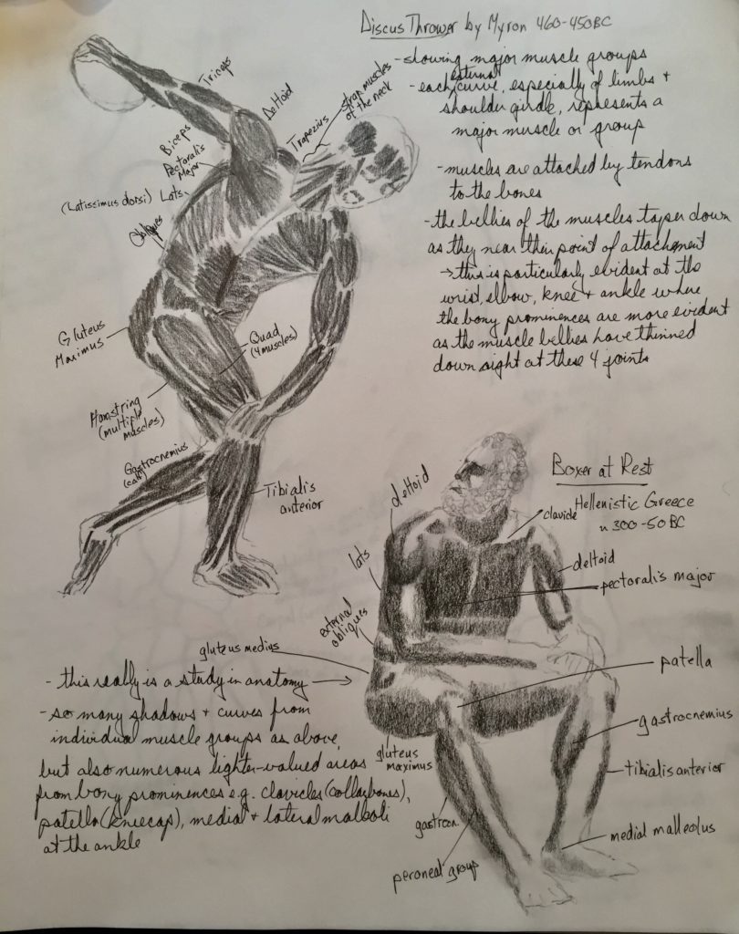

The Figure and Anatomy notes
-artistic anatomy- how the substructure of the human form influences the surface appearance – this especially relates to the skeletal and muscle structures, their relationship to each other, and their relationship to the visible surface of the fleshed figure
-surface activity can be very subtle or very abrupt
-bony landmarks- where skeletal structure rises to the surface and makes itself evident
-musculature- note especially how it relates to the skeletal structure and how it changes with various movements and positions of the body
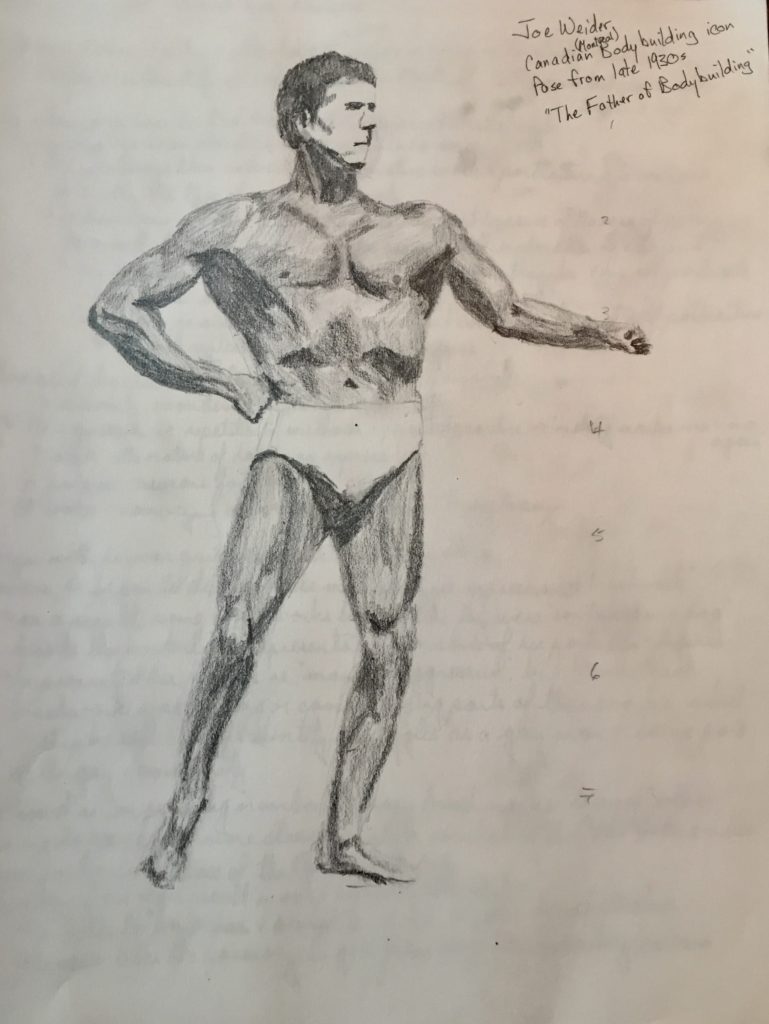
Cumberland Life Drawing October 21st


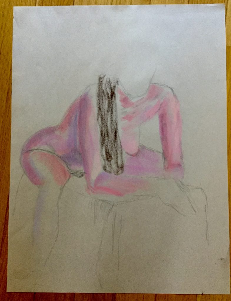
GESTURE DRAWINGS October 30, 2020

Charcoal pencil 
Charcoal pencil 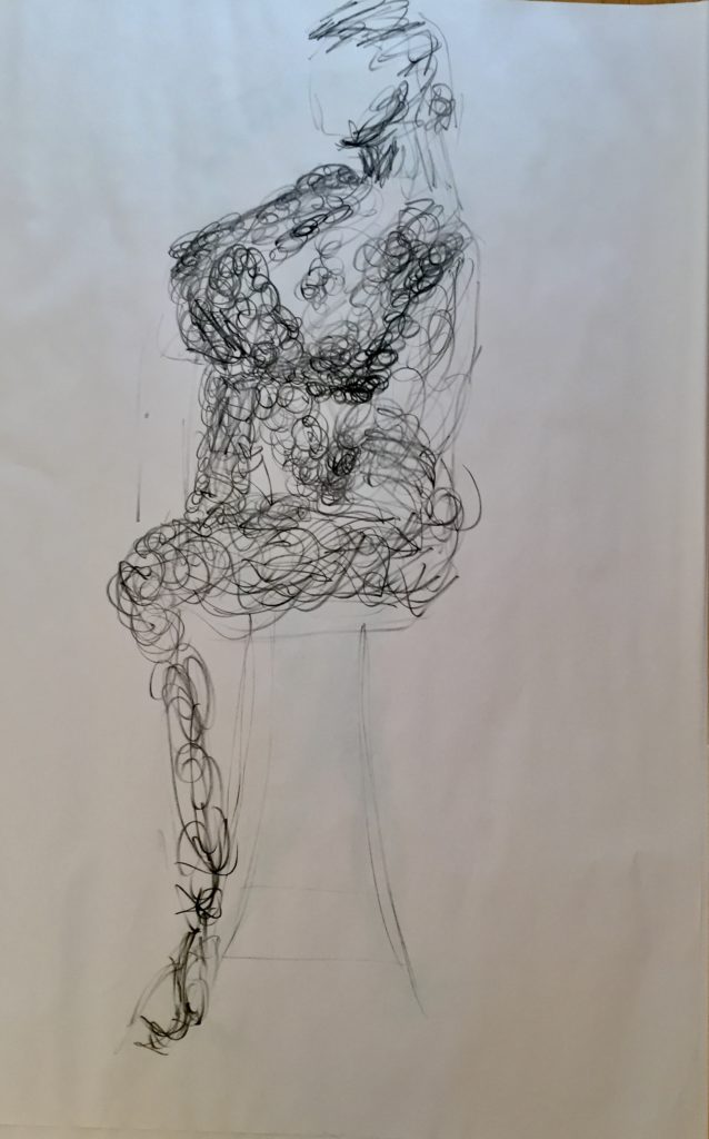
Charcoal pencil 
Conte – negative space 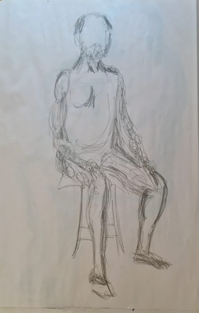
Graphite 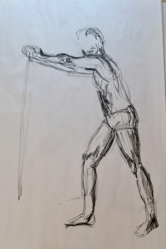
Charcoal pencil 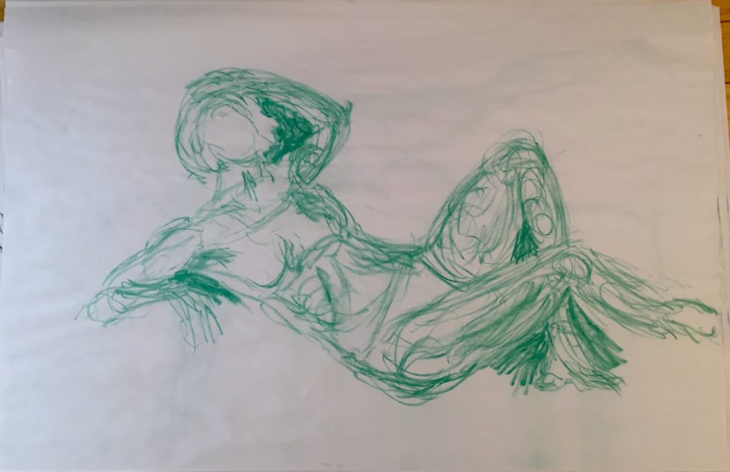
Conte 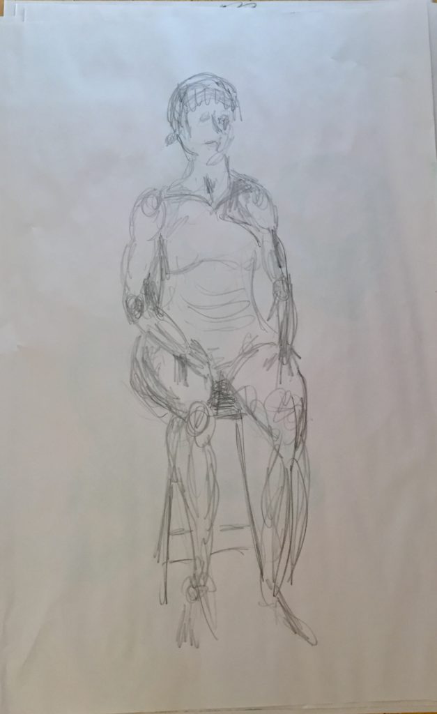
Graphite
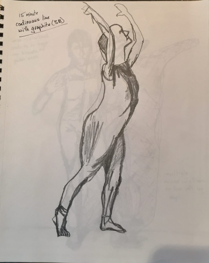
15 minute continuous line
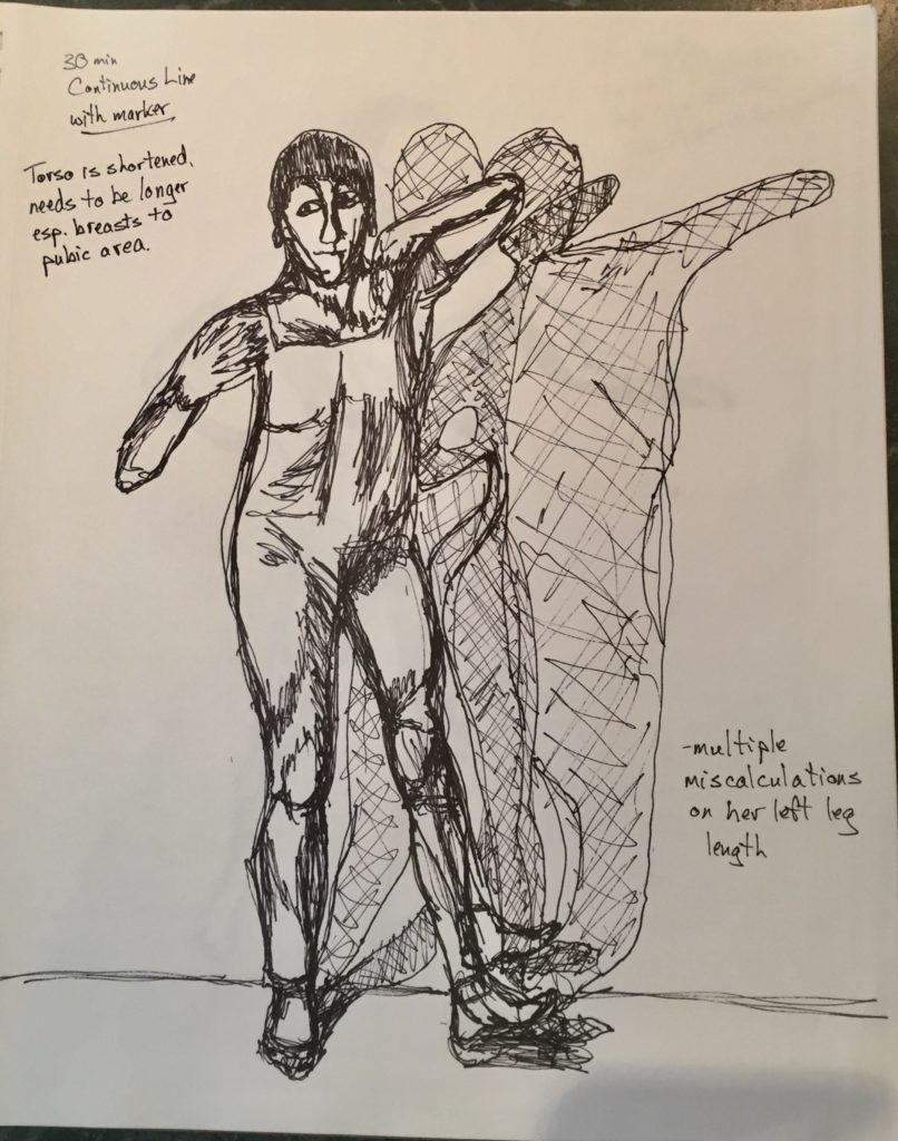
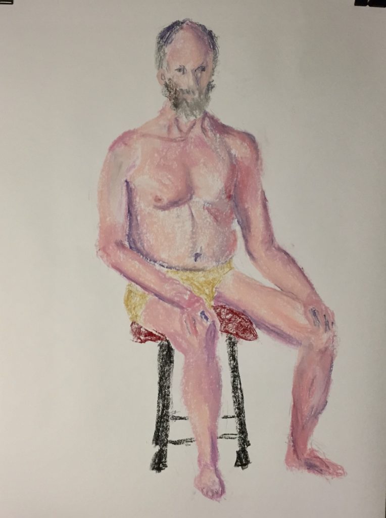
Sketchbook drawings
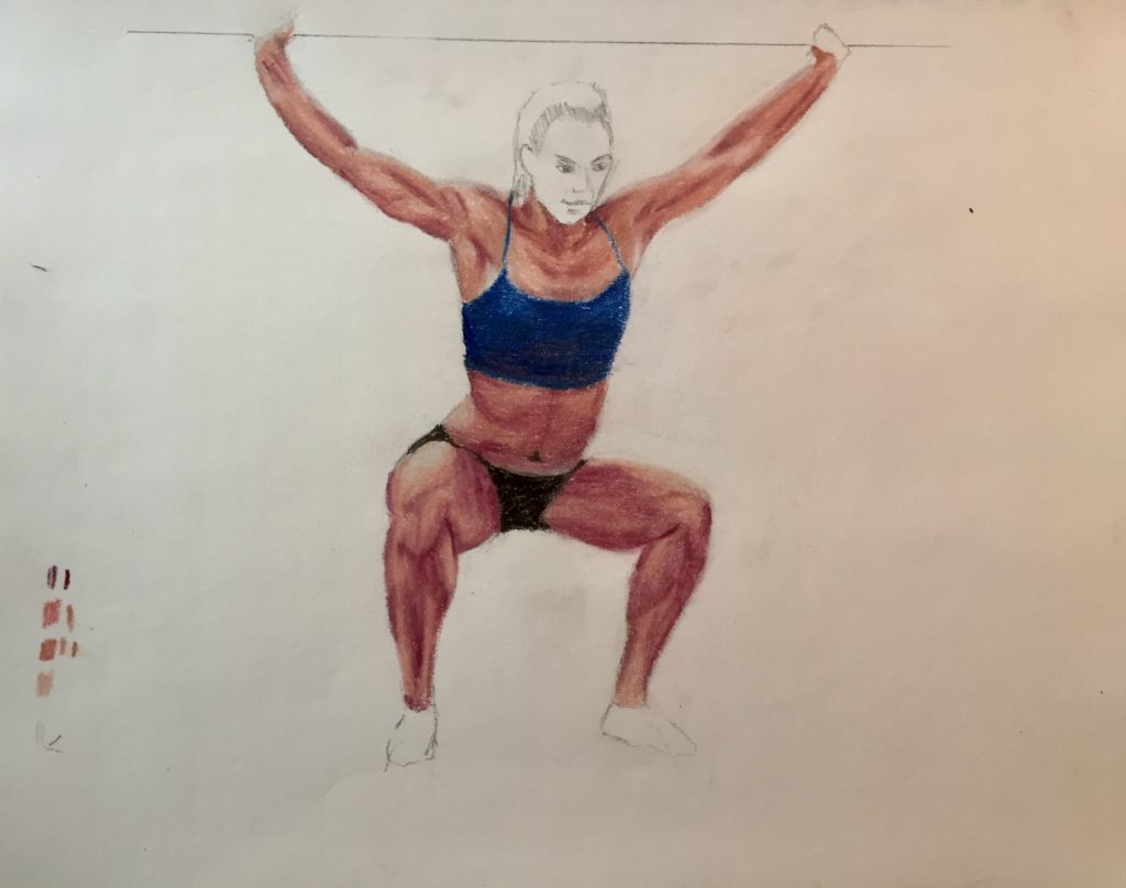
Cumberland Life Drawing November 4th


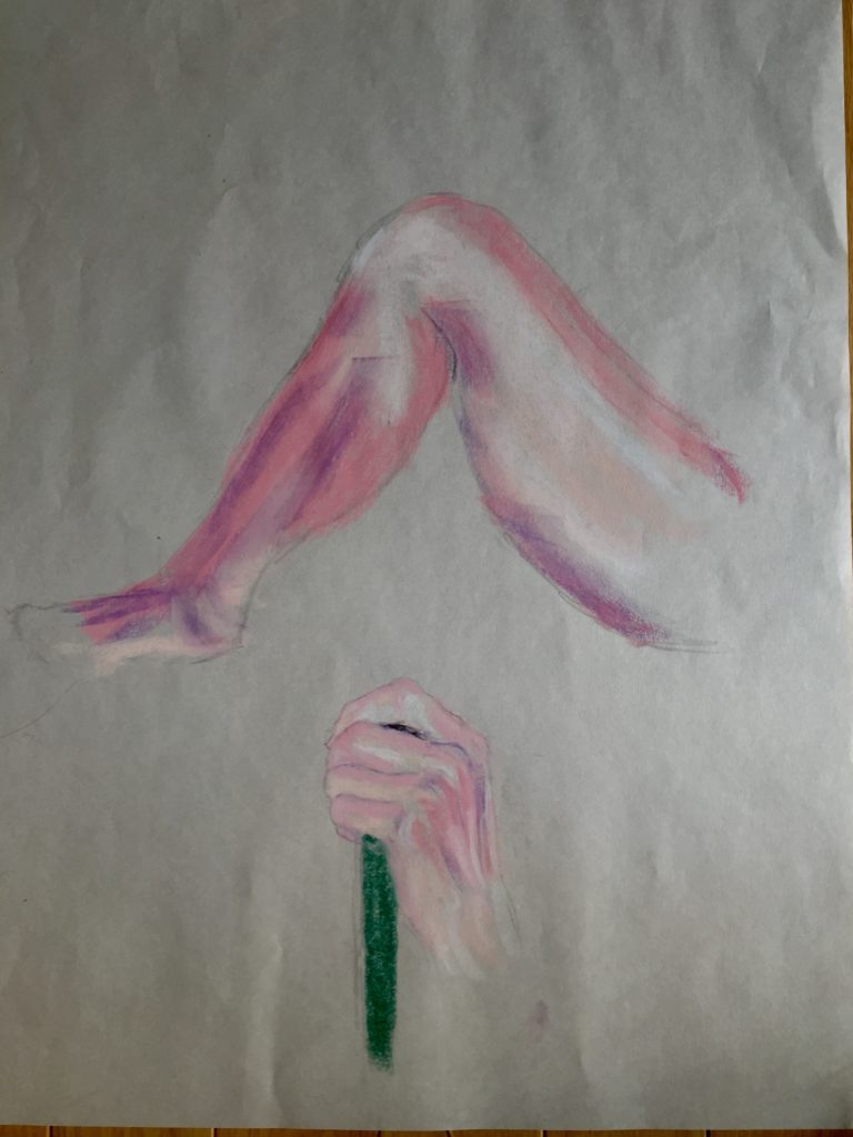
Drawings – Week of November 2nd
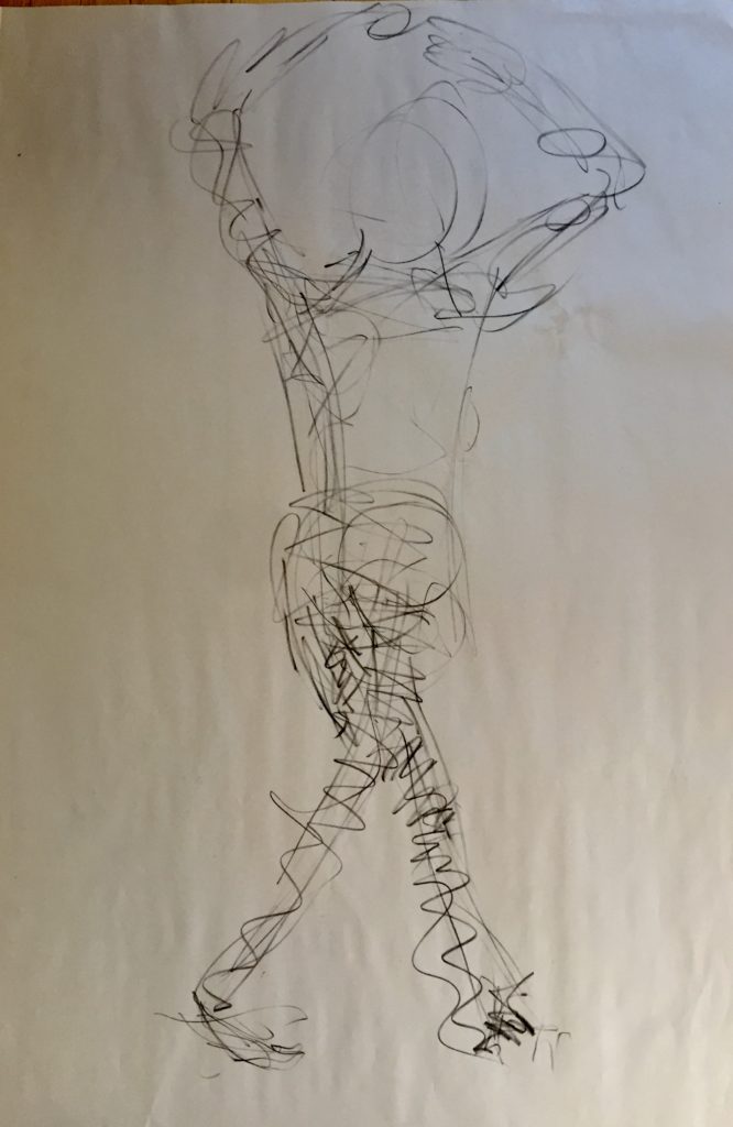
Charcoal 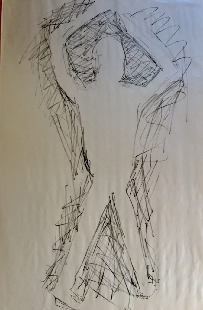
Charcoal negative space 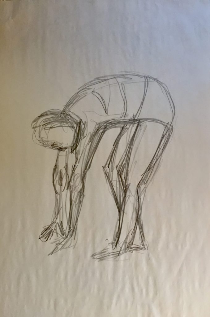
Graphite sustained 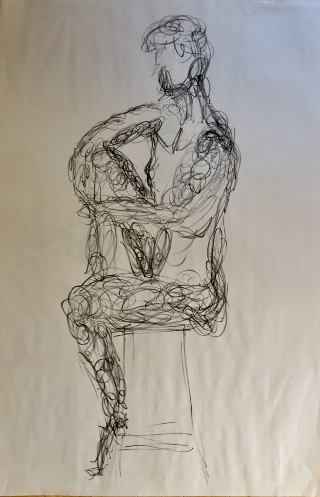
Charcoal scribbled 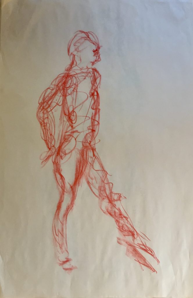
Conte, maybe some mass effect 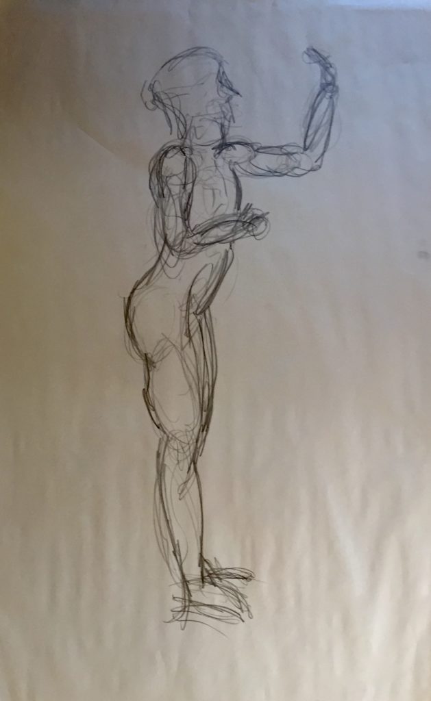
Graphite, sustained 
Charcoal 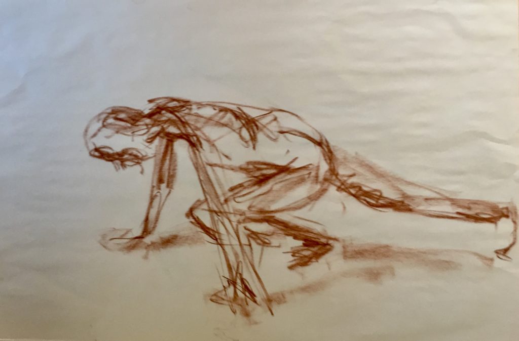
Conte

Ink background, plain paper, chalk pastels 
Black Stonehenge paper, chalk pastels

Week of November 9th

Hand on left done next, trying a variety of colour combinations. 5th finger and hypothenar eminence were done using only 3 different hues. I am most satisfied with that.
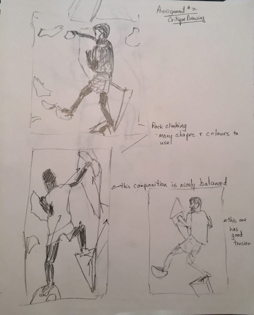
Critique Drawing
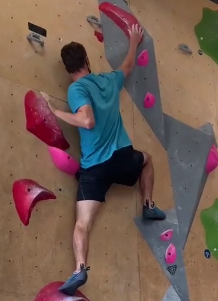


“New Horizons”, October, 2020. (22″ x 30″)
Chalk pastel on white Stonehenge paper.
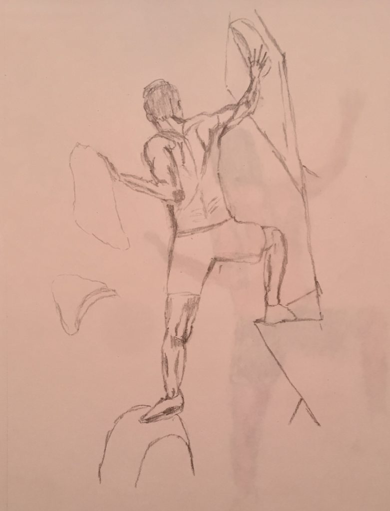
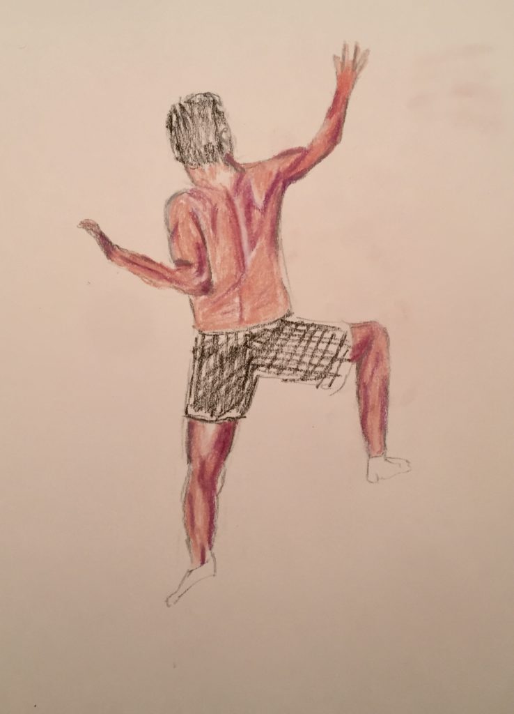
Although enjoying himself, my son was finding life away from home for the first time somewhat difficult, especially in the face of the pandemic. So when he sent me videos of himself rock climbing I felt the parallels with what he was facing were very evident. I reviewed a variety of figure positions in the videos, but felt this was the best as it had areas of muscle tension and relaxation, some challenging foreshortening, and I liked the sense of movement of the figure up the wall. The holds/rocks are as they were in the video, so this further convinced me to use this composition as they too contributed to the sense of movement.
I felt limited by the detail I could get with the chalk pastel, but perhaps a larger variety of colours might help. In my mind, I wanted this to be more finely detailed and shaded, but I was left feeling the chalk pastel don’t lend itself to that effect. The raw sienna I used for the background was more concentrated where I had rubbed out my drawing grid lines, and I couldn’t get rid of it. However, it mimicked nicely the seams of the plywood on the walls anyway, so I left it and thoroughly erased all the grid lines to get the same effect.
