FIN 201 Unit 1
FIN 200 Unit 2
FIN 200 Unit 1
THIS A TEST POST TO SEE IF IT GOES TO THE CORRECT SPOT:):):)
Gear for phone interview
Creative Processes

FIN 135 Unit 1
FIN 145 Unit 3
FIN 145 Unit 2
FIN 145 Unit 1
FIN 140 Unit 3
ARTIST RESEARCH – Simon Evans (and Sarah Lannan)
“Everything I Have”, 2008. (60″ x 40″)
Pen, paper, scotch tape, correction fluid and inkjet prints on paper. From: invaluable.com.

“Everything I Have”, 2008. Detail.
From: reflag.org.

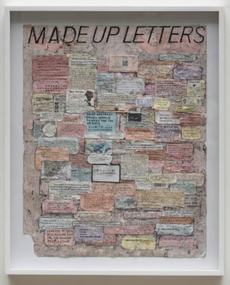
“Made Up Letters”, 2018. (28″ x 22″)
Paper, pen and tape on paper. From: artbasel.com.
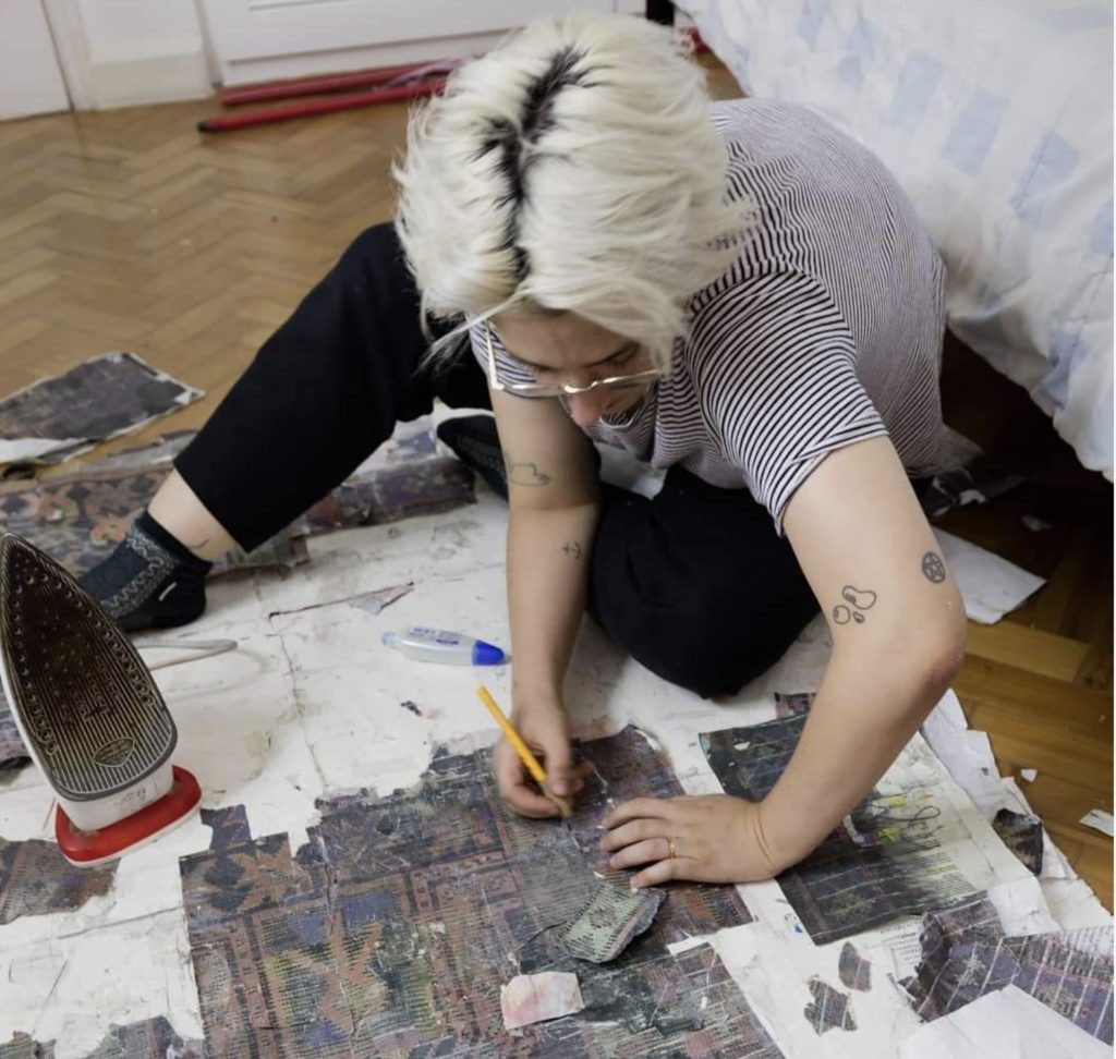
Sarah Lannan (left) and Simon Evans (right) at work.
Simon Evans is a 48 year old British-born artist who is best known for his ‘drawing as diagram’ type of artwork. He was a professional skateboarder and writer before becoming an artist. He began to exhibit his work in 2003.
Evans uses diagrams, maps, charts, advertisements, diary entries, inventories and cosmologies to present his works. They tend to be text-based works, often collaged, and present collections of ideas, phrases, drawing and images. His intention is to portray his perception of the state of contemporary society, commenting on its inequities and inadequacies, but also seeing the humour and irony in that same world. There are recurring themes of, for example, religion, mindfulness and consumerism, but they are always presented with a witty sense of humour.
Viewing Evan’s work was difficult on the computer because of the small size of the pieces that make up most of his artwork. You can appreciate what he is trying to say in an individual piece from a distance, much like viewing a painting, but I really wanted to get right up close and examine the detail in the pieces. There is an earnestness and almost a naiveness in the amount of detail in his works, as if each scrap is revealing something personal about him. At the same time his works are very tongue-in-cheek and offhand, and its hard not to experience these two feelings as you view his works.
Most of Evan’s pieces are done in large format of, say, several feet by several feet. They are generally extremely dense and highly detailed. The two principal components of his works are scotch tape and bits of text that he has either collected or printed himself. You will also find multiple scraps of paper from various aspects of daily life, pieces of foil, wrappers, pencil shavings, pieces of advertisements and many handwritten notes. It’s as if he is trying to make sense of the world and his place in it, and reassure himself that everything is going to be okay.
A talk about Simon Evans would not be complete without mentioning the idea of art by collaboration. In 2006, Evans met Sarah Lannan, a commercial illustrator. They became a couple and she began to help him with these very labour-intensive artworks. They married in 2011 and are described as having an “intense, deep connection” and operating “as one being”. However, in a 2014 WSJ article, Lannan suggested that it was inaccurate to credit only Evans for these works and around that time they began to acknowledge her contributions to these productions. Fast forward 6 years to 2020, and all their work is now produced under the name “Simon Evans TM”, itself perhaps a tongue-in-cheek nod to the contemporary art world. They are very cheeky and cagey in interview and don’t give straight answers to this issue of why just his name is credited. I get the feeling they thrive on the controversy, which is no doubt contributing to the success of their collaboration.
3 Artists: Wangechi Mutu, Gyula Sagi and Cy Twombly
Assignment #3 Ideas
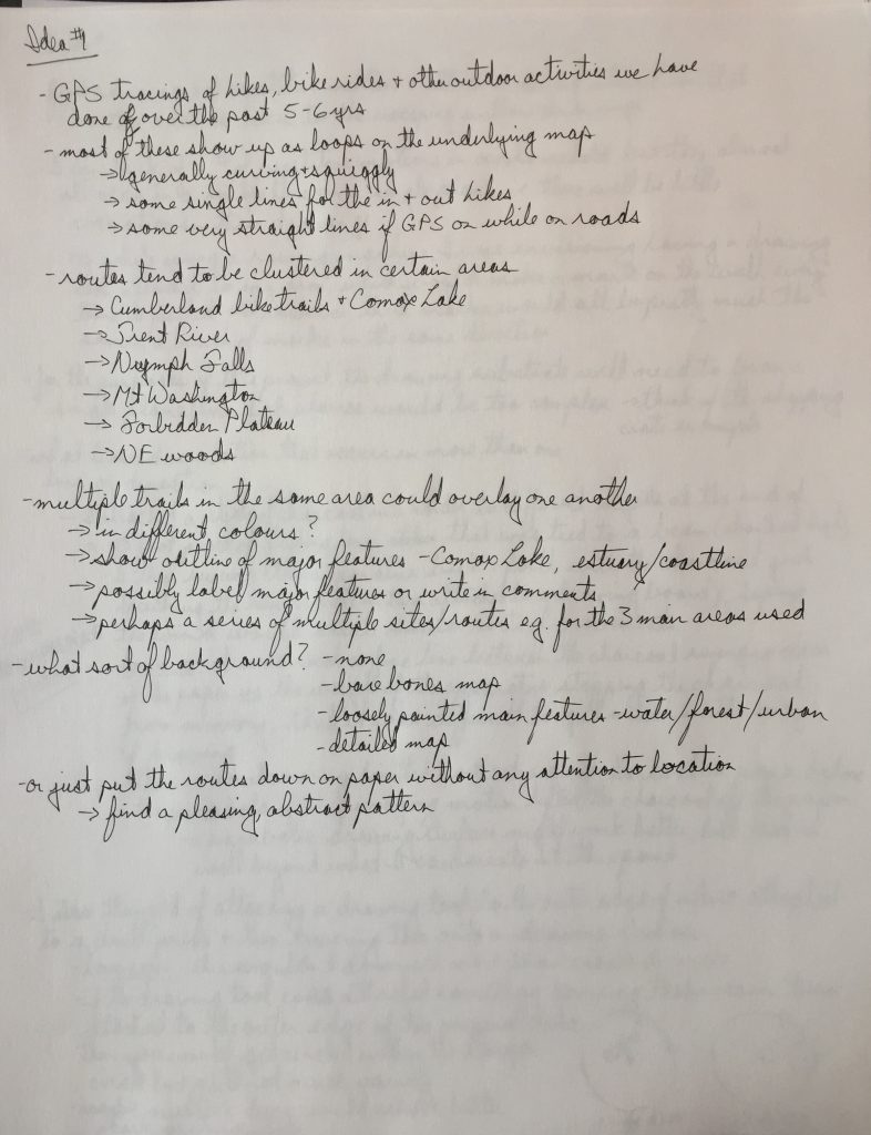
Idea #1 – GPS tracings
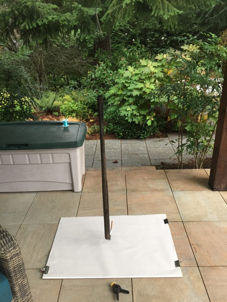
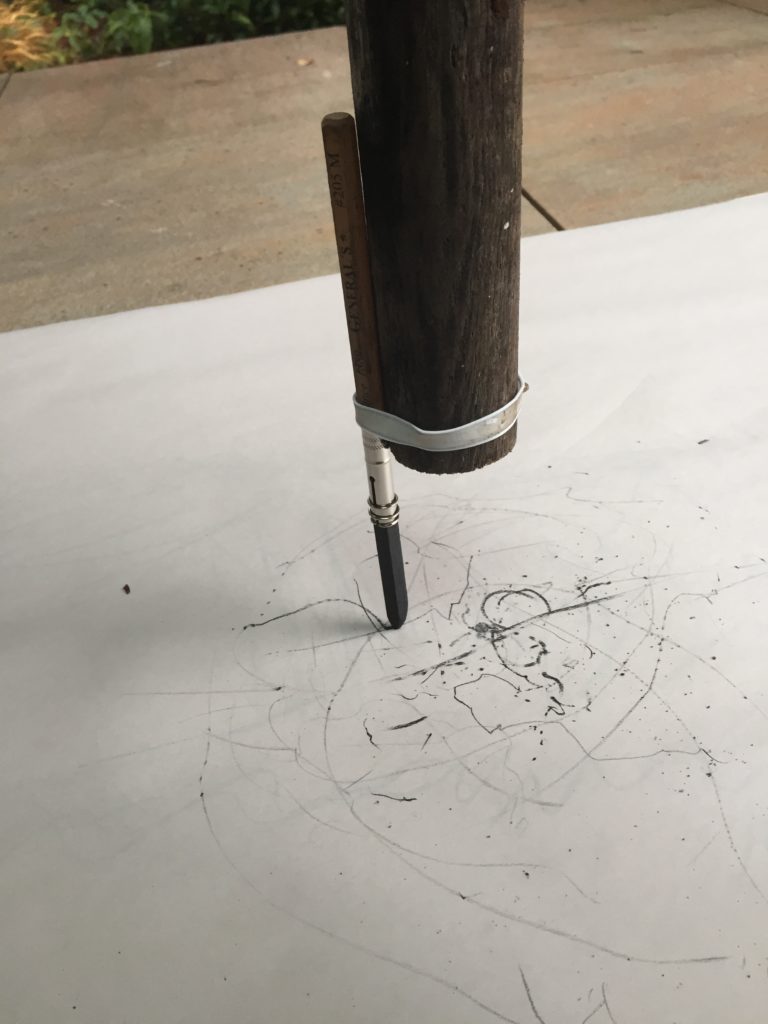
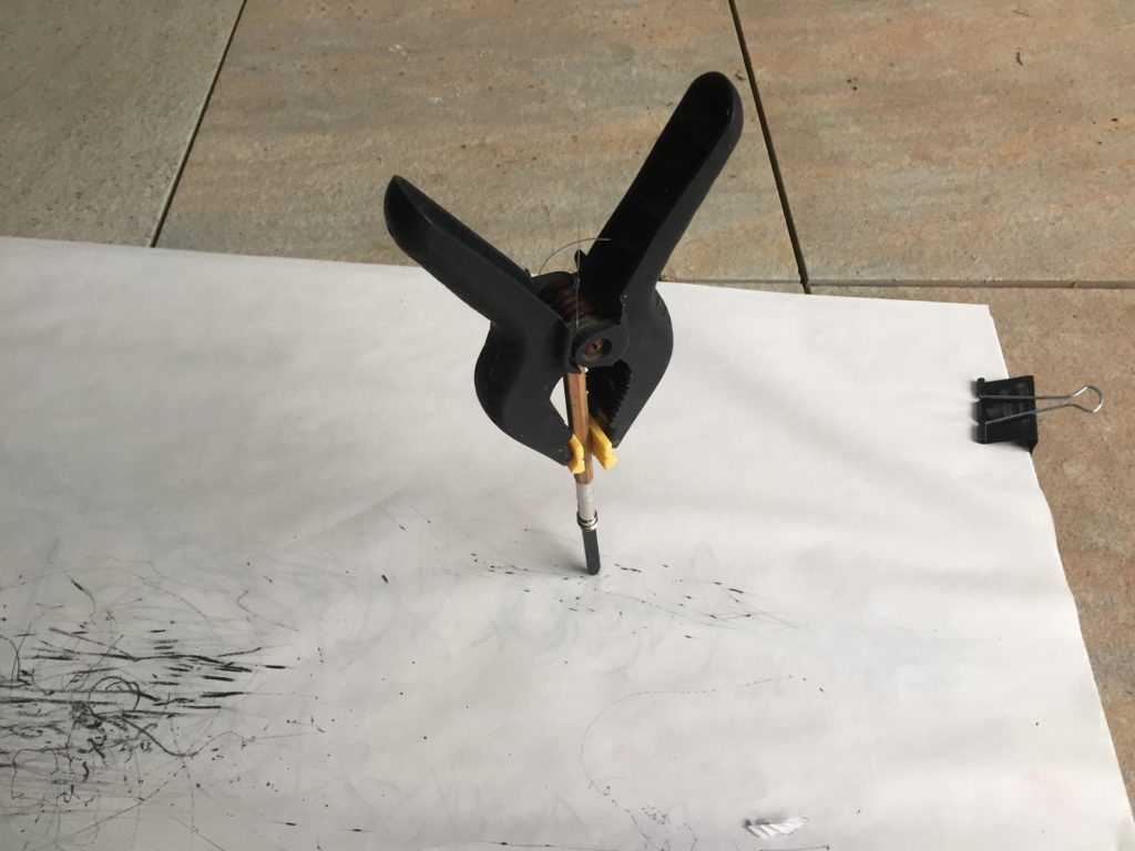
Idea #2 – Repetitive motion
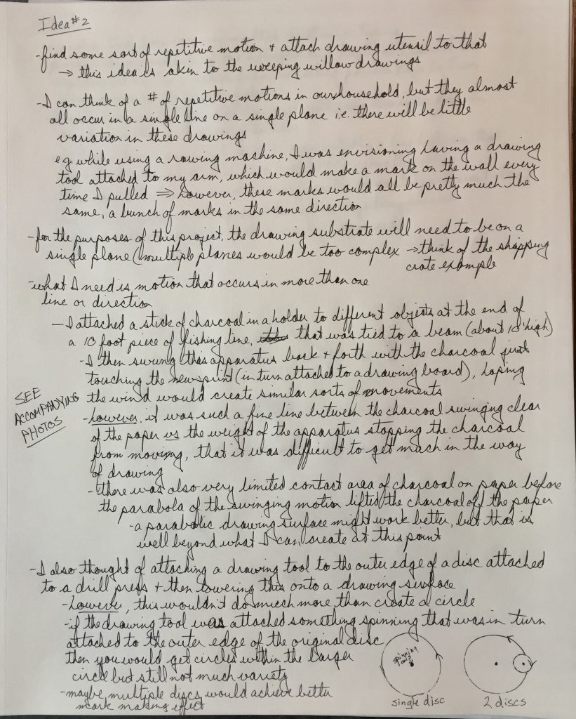
Idea #2B
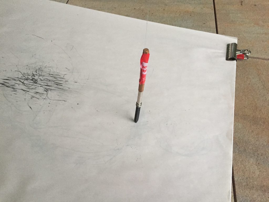
Idea #3 – Hanging clear plastic in a window, trace the viewed objects with marker on the plastic from a variety of positions. I was hoping there would be distortion and overlap of objects from their different viewpoints, but the effect didn’t amount to much.
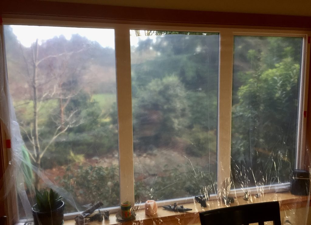

Drawing of about 10 trees and shrubs from 5 different positions in front of the window. 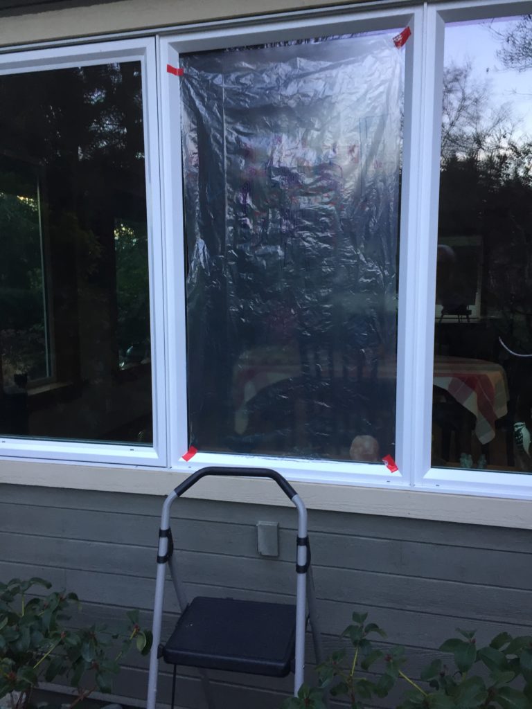
I then hung plastic outside the house and traced the interior view, much like Albrecht Durer’s woodcut of a draughtsman practising foreshortening. A fun exercise, but as an alternative form of mark making it didn’t accomplish much. 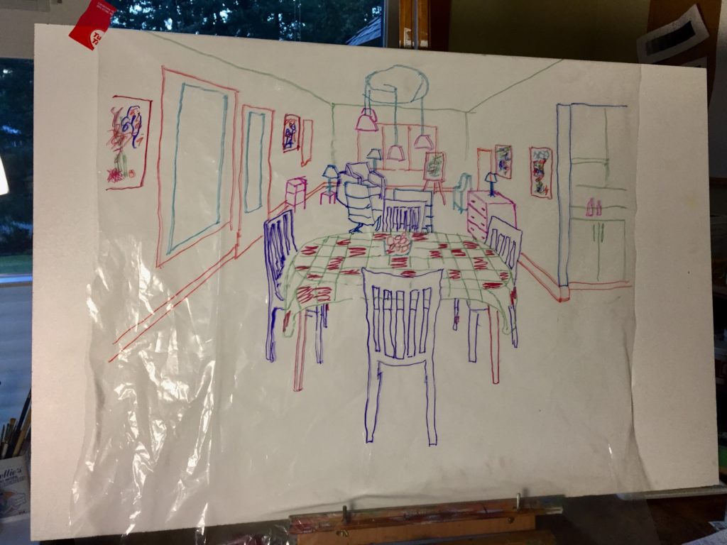
Idea #4 – Drawing as diagram
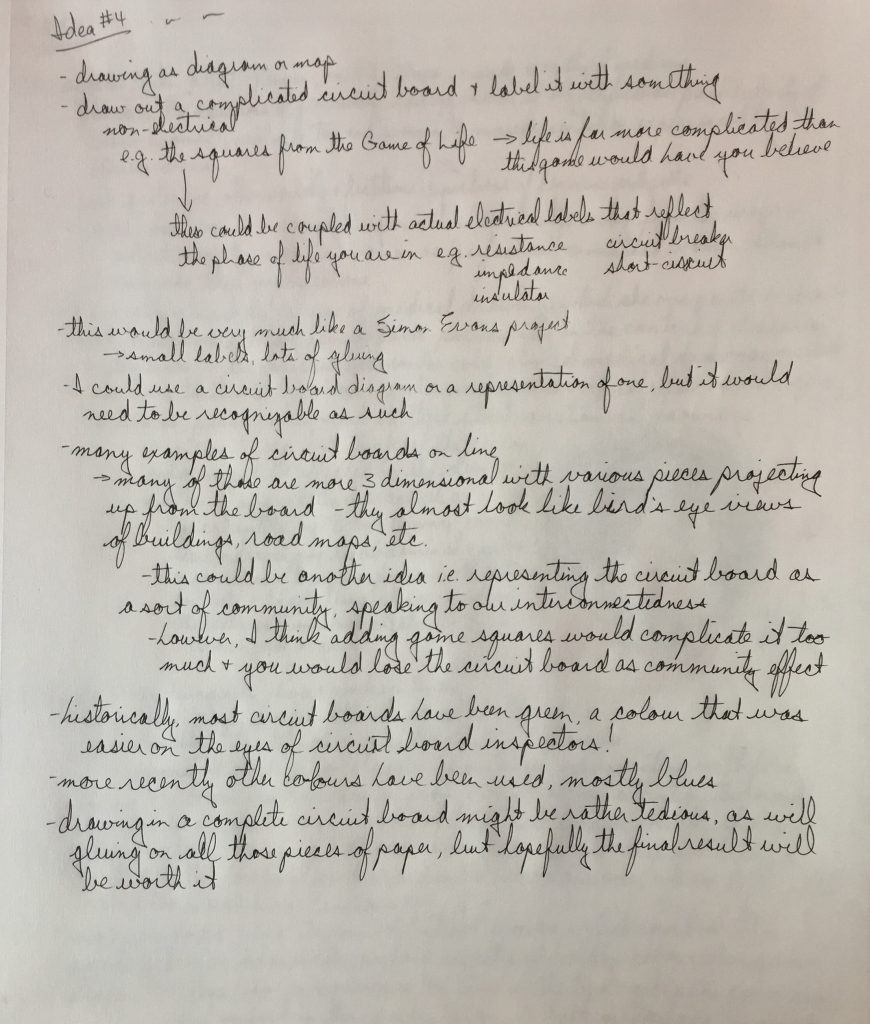
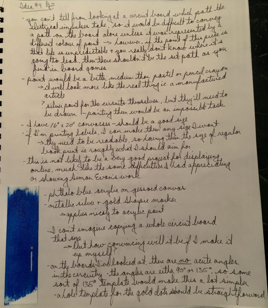
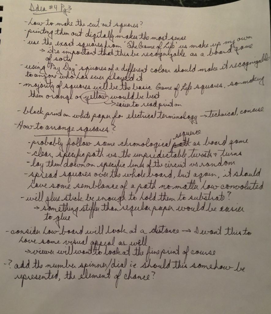

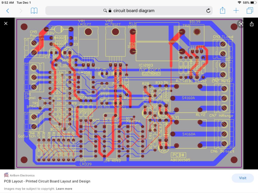
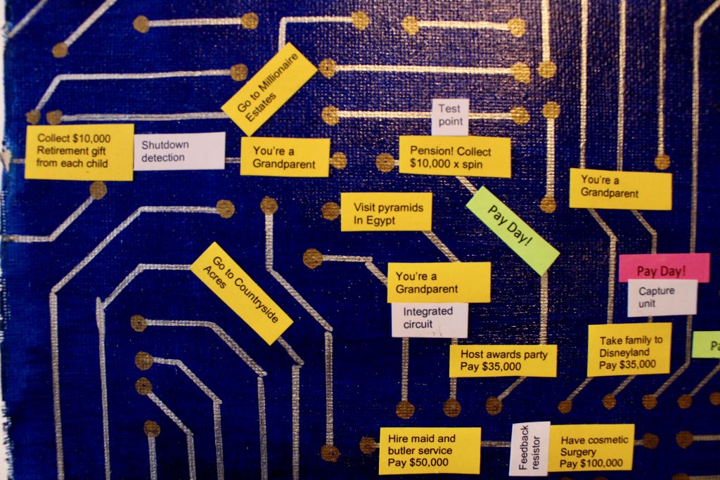
The above two images were of 2 dimensional circuit boards that caught my eye. I was looking for something that would be aesthetically pleasing, especially with many labels of different colours glued to it. I didn’t think the standard green colour would work too well, so I chose the blue in the second image here, which matched well with the phthalo blue acrylic paint I had. I bought silver and gold metallic Sharpie permanent markers, which went on the painted canvas very well. I copied the first few lines of my circuit board from the image above, but after that I could see different ways in which to create patterns and how to lay the angled lines down along side each other. Not much different than doing a jigsaw puzzle. As long as I avoided being too repetitive, it ended up making a nice looking circuit board replica. I made a plywood template with a 135 degree angle to draw most of the angled lines. I punched holes in an old plastic card as a template for the gold circles.
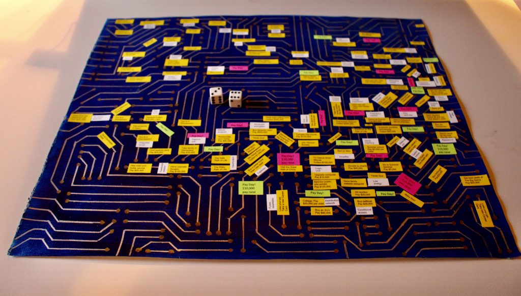
Title: “Flow Chart”, 2020, (16″ x 20″). Cardstock, glue, acrylic paint, and permanent Sharpie marker on canvas.
My intention with this piece was to create a diagram with labelling that would mimic a board game, in this case ‘The Game of Life’. However, I wanted to portray my perspective on how complicated and unpredictable the twists and turns of life are at various stages of one’s life. I chose a circuit board to represent the framework and potential pathways life can follow, the circuit board being infinitely more complicated than the simple path of ‘The Game of Life’. The route starts in the upper left and moves across to the upper right for one’s 20s and 30s, before turning down into the 40s and 50s, and back across to one’s 60s at the left side of the board again. The yellow squares are based on the life choices and events one faces, the Pay Day squares are in pink and green, and the white terminology squares are meant to be comments, puns or double entendres relating to the other squares they abut.
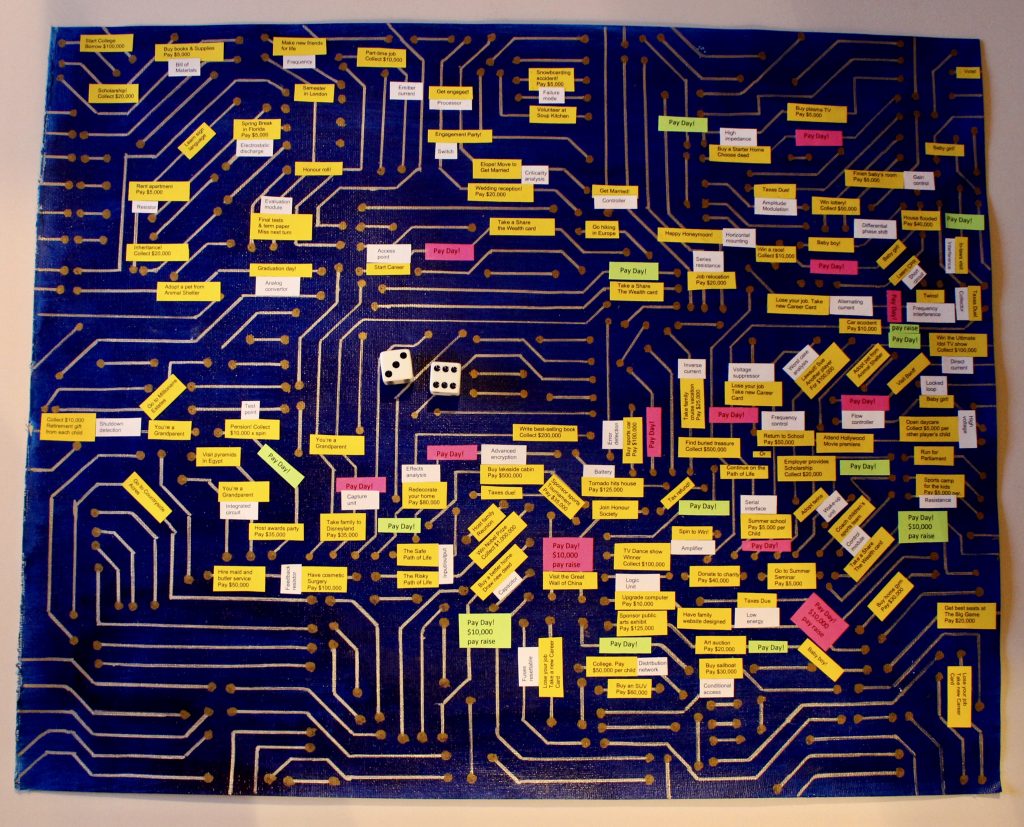
This is a difficult piece to appreciate without being able to get right up to it and see the flow and overall trends. I could have done something to the background to make the overall path more evident. I didn’t personalize this, as I wanted it to be recognizable as ‘The Game of Life’. However, I could have made the yellow squares more humorous and current, getting away from the more naive content of the actual board game. I think that would have improved the viewer’s experience and made it more interesting.
Upper left detail (below)

Upper right detail

Bottom right detail

Bottom right close-up

Bottom left close-up
FIN 140 Unit 2
Bonus Points Artist Talk – Scott Bertram
Scott Bertram is an abstract painter who now lives and work in the Comox Valley. In his November 20th artist talk, Bertram traced his path as an artist, from his days as an undergraduate to the projects he is working on at present.
The first works he showed us were from his last year at UBC-O in Kelowna (2007). Here, his works were predominantly combinations of less-defined grey backgrounds and coloured (especially pink) figures/shapes closer to the picture plane. This separation of “ground” and foreground and the clear definition of space between them was and remains a predominant theme in Bertram’s work. At this point he was also establishing his “horizontal approach” to painting, i.e. creating his art on flat, horizontal surfaces.
Attending NASCAD in Halifax in the following years, Bertram explored a process he calls “single day painting” by which limiting the duration of his creations he avoided external voices and opinions about his works. He continued to work with spacial cues and elements of gravity. He used no source material for these works (they were completely unplanned), although he did begin to include things external to his own imagination.
During a subsequent exchange to Hamburg, Germany, Bertram began extracting shapes from old Gothic sources, applying them in unplanned ways to his substrate and then painting the spaces created by the outline of these shapes. This progressed to taking the original compositional structure of these shapes into account, by which some of the compositional control was taken out of his hands. His focus remained on creating space or an illusion of space and how negative and positive spaces related to these shapes. There continued to be unplanned elements in his works, his choices of colours depending on what was at hand rather than what fit schematically.
Moving to the Comox Valley in the early 2010s, Bertram continued to explore the use of space and the use of less distinct, transparent backgrounds. He found inspiration in the local forests and the “light holes” in those forests. He created works emulating the multiple layerings of nature, while his finished products showed no concrete associations with the forests themselves. Bertram was also becoming increasingly aware of the process of finding inspiration and stimulation in unintended ways and objects, including shapes, gestures and even his scraping tools, incorporating these into his artworks.
Over the past few years, Bertram has become increasingly embedded in his art community. During a residency at the CVAG, Bertram made use of the large space there to create larger pieces of art. He built a large scraper through which he would pull his canvasses. What he created was not necessarily what he intended, but this didn’t mean the process had failed. The final results were often nonetheless pleasing; what had worked as part of the creative process was what was important.
During this residency, Bertram also realized how much he enjoyed both the physical and the visual interactions with larger artworks and these have been a significant part of his practice in the past few years. He believes it helps more fully immerse the viewer in the viewing experience. Bertram currently rents a large studio space in which he continues to work on this larger scale. One of his recent interests has been to explore the tensions between disparate elements in his works, while also making use of the continuity that exists between them. What hasn’t changed so much over the years is that his pieces still have edge to edge grounds, with the space in front of these populated by shapes.
I still struggle to appreciate abstract art, but I was grateful to hear the creative processes by which Bertram creates his works. His explanations of how he arrived at his finished products added an element of understanding of abstract art for me, rather than the usual exploration of the meaning and significance of a finished piece. I was also intrigued by what I saw as the increasing maturity of his artwork over the years. His contemporary pieces strike me as more complete statements. They have a cohesiveness, a unity and a sense of wholeness that was not as apparent in his earlier works. It left me feeling like his artistic journey has been one of accomplishment and ever-evolving progress.
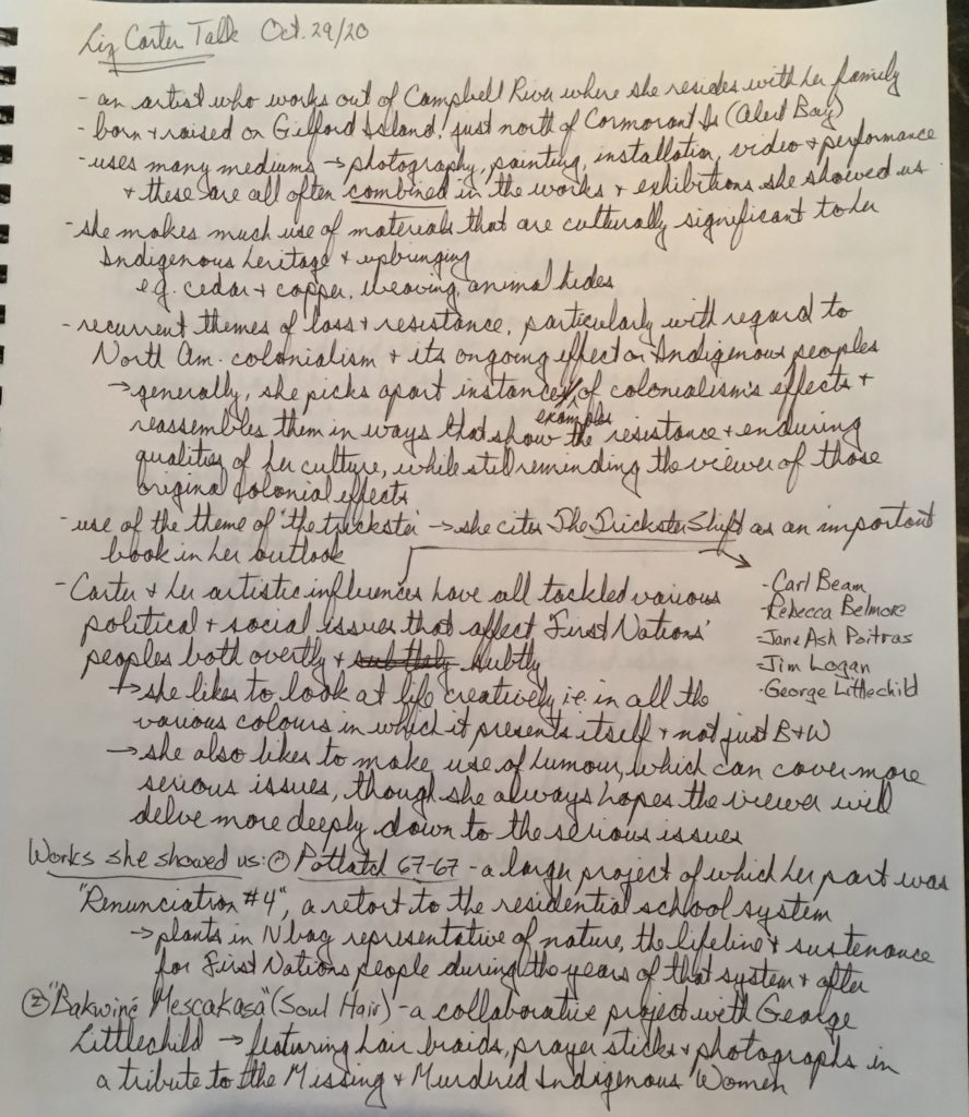
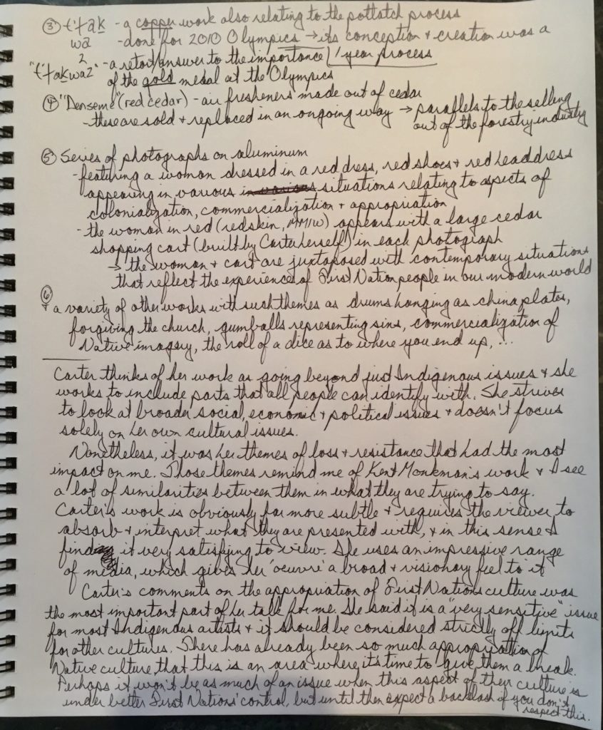
ARTIST TALK – Liz Carter
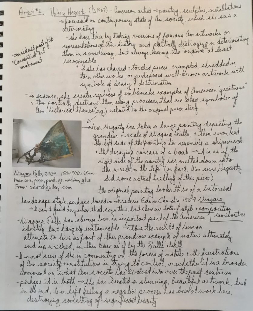
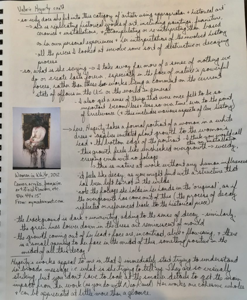
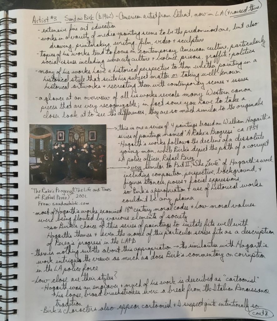
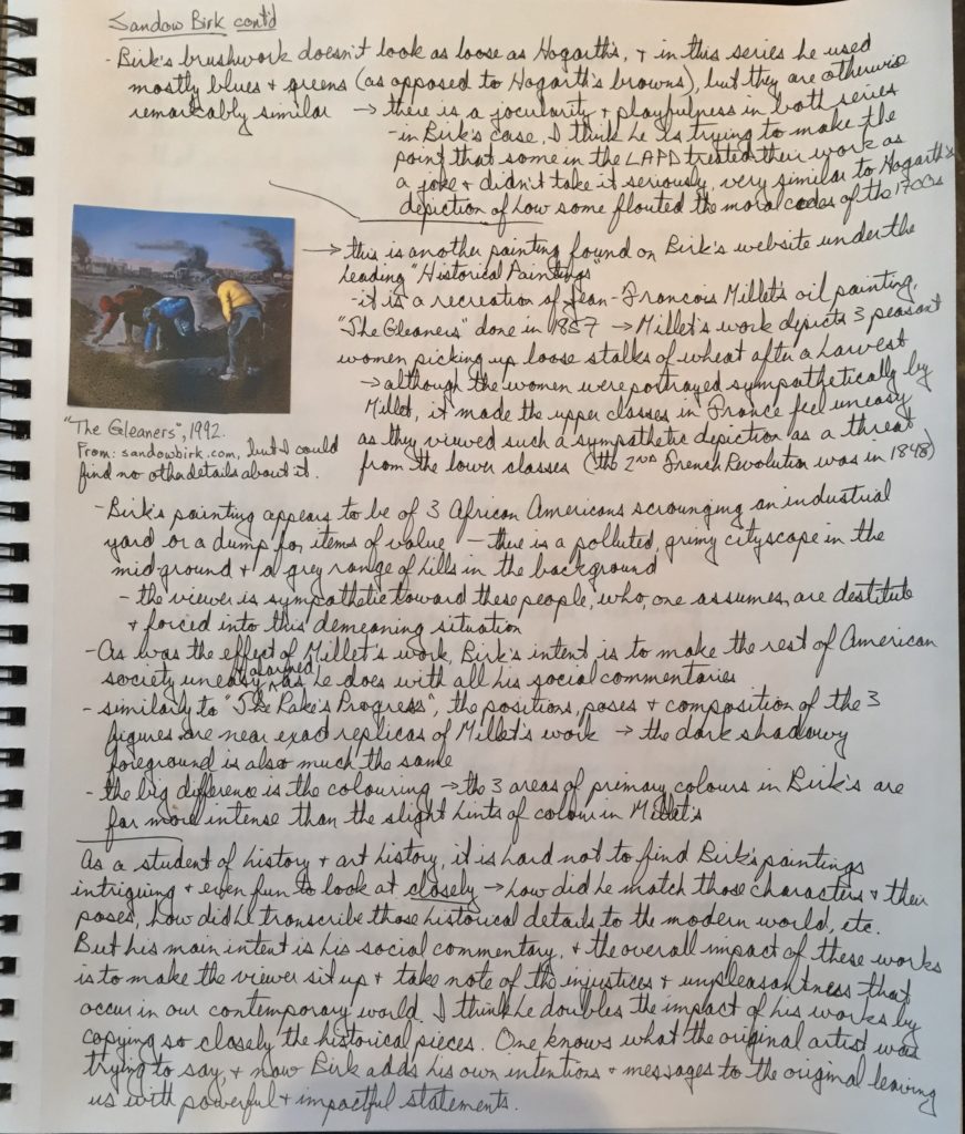
ARTIST RESEARCH – Neo Rauch, Valerie Hegarty and Sandow Birk
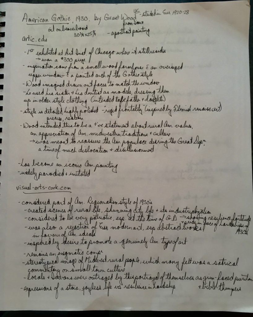
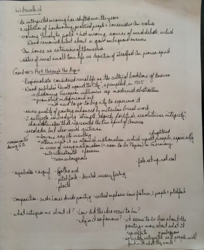
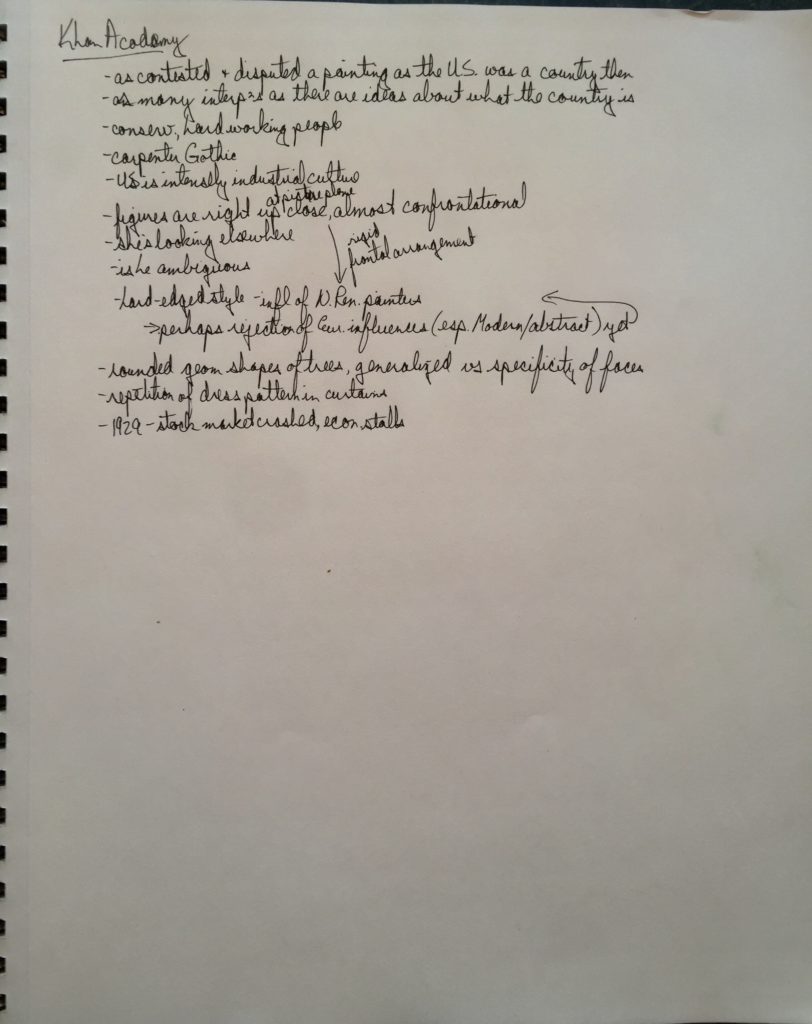
Dialogues with History – “American Gothic”
Written Analysis of Artwork
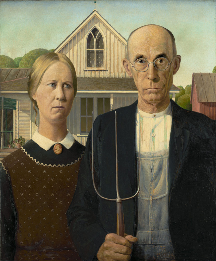
American Gothic, 1930, by Grant Wood. Oil on Beaverboard. 30 3/4 x 25 3/4″. Art Institute of Chicago.
I chose this painting as its popularity and iconic status have long fascinated me. In its simplest form it is a portrait of two figures, presumed to be a farming couple, standing in front of a wooden house. The couple’s expressions are severe, if not ambiguous, and it is difficult to grasp exactly what Wood’s intentions were in painting this. How then did it become such an icon of American art, one of the most parodied and reinvented pieces of the Western Canon?
Grant Wood was 39 and a struggling artist when he painted this in 1930. A house in rural Iowa was the initial inspiration for the painting, and he used his sister and his dentist as models for the figures. Its title refers to the then popular rural style of architecture, known as “carpenter Gothic”, that appears here in the pointed arched window of the upper floor. ‘Gothic’ can refer to more than just architecture though. In this case the mood too feels Gothic. The sternness of the couple’s faces, the dark clothing and the presence of the pitchfork give the viewer an uneasy feeling about what is going on. Is that pitchfork a tool of the devil and does the woman’s lock of hair look like the devil’s tail?
The Gothic window and its gable effectively divide the painting in two with one figure on either side. The verticality of the window is accentuated by the pitchfork and the figures’ elongated faces and bodies. The figures are large and right up close to the picture plane, perhaps guarding the house or even confronting the viewer. Wood painted this in meticulous detail with hard edges and precise brush strokes, adding to the severe look of the couple. He had spent much of the 1920s studying and painting in Europe and it is felt that the Northern Renaissance painters, such as van Eyck, had much influence on his meticulous brushwork and the frontal presentation of his figures.
Wood himself was an Iowan who had grown up in an isolated rural environment, so it was easy to think that he was championing rural values in this painting. The immediate reaction to the painting was quite varied though. Some thought it was a satire on rural life, making fun of these small-town people and their culture. Many Iowans themselves were upset by the painting, feeling they were being portrayed as grim-faced puritans and bible thumpers.
Others considered it to be a very patriotic painting, showing resilience, dignity and fortitude in the face of the hardships they were facing in the 1930s. The stock market had crashed in 1929 and the Great Depression was gathering steam. People were looking for reassurance and strength, and this painting answered that for them. Still others viewed it as an example of the staunch nationalism that had started to grow in the United States. They saw this as frightening and dangerous, especially in view of the rising nationalism and fascism in Hitler’s Germany. Wood didn’t contribute much to clearing up issues around his intentions with the painting. He was either silent about this or his answers were ambiguous.
Wood is considered one of the leading artists of the Regionalism style of painting, artists who championed rural culture and the pioneer spirit as the backbone of America. He published a pamphlet called “Revolt against the City” in 1935 in which he promoted rural and indigenous American art, while disdaining European artistic influences, especially those of the modernist abstract artists.
Since then, there have been as many interpretations about this painting as there have been ideas about what the country of the United States represents. That to me is why has this work been so popular and iconic. It seems to be less about the virtues of it as a work of art and more about what it represents socially and politically and how it should be interpreted. So many of the features and details of the painting are ambiguous and enigmatic and people are always going to find what they want in this piece. There will never be any definitive answers about it and it will always remain open to interpretation.
SOURCES:
- Gardner’s Art through the Ages: A Global History, Fifteenth edition. By Fred S. Kleiner
- arctic.edu
- visual-arts-cork.com
- widewalls.ch
- Khan Academy: “American Gothic”
Artwork Research
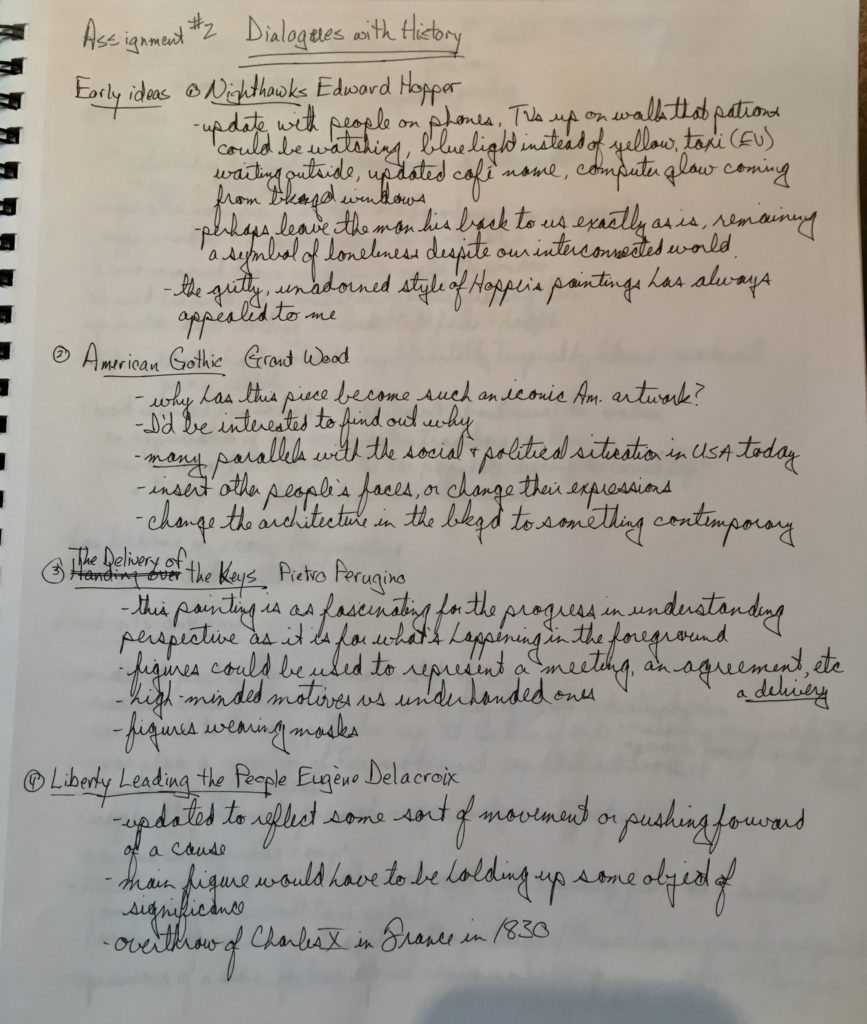
PROCESS WORK
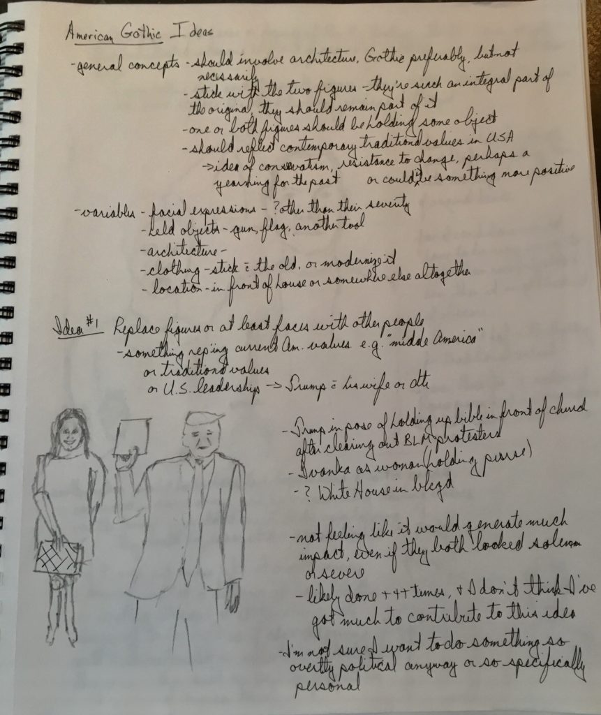
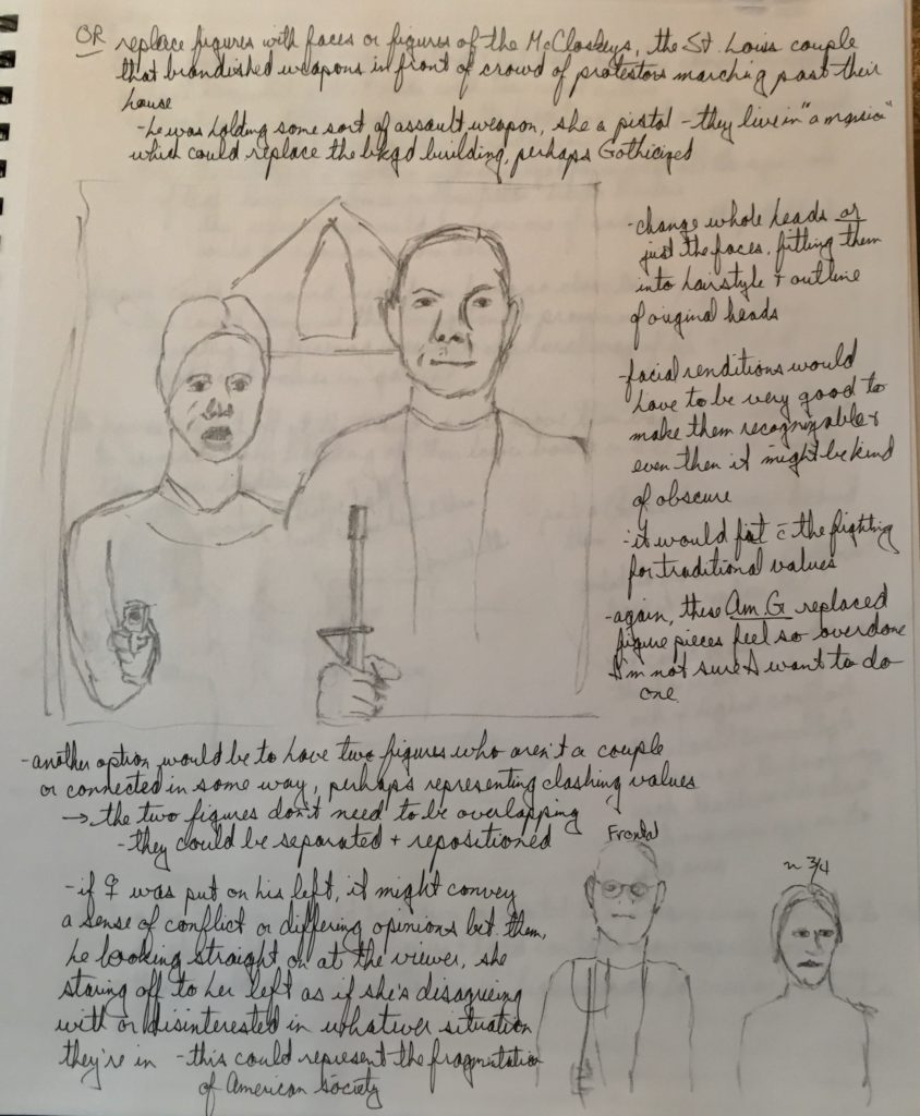
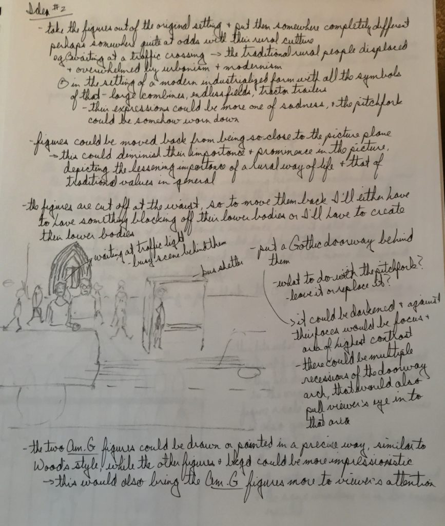
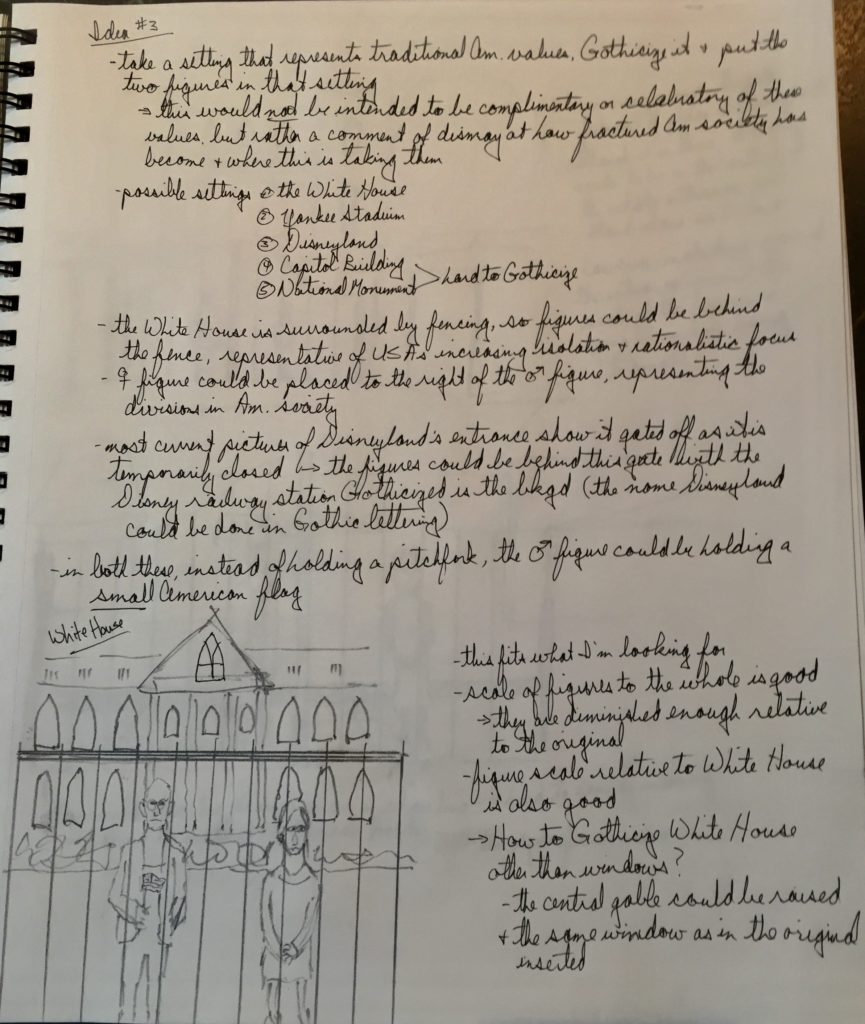
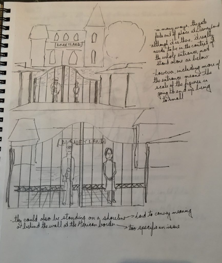
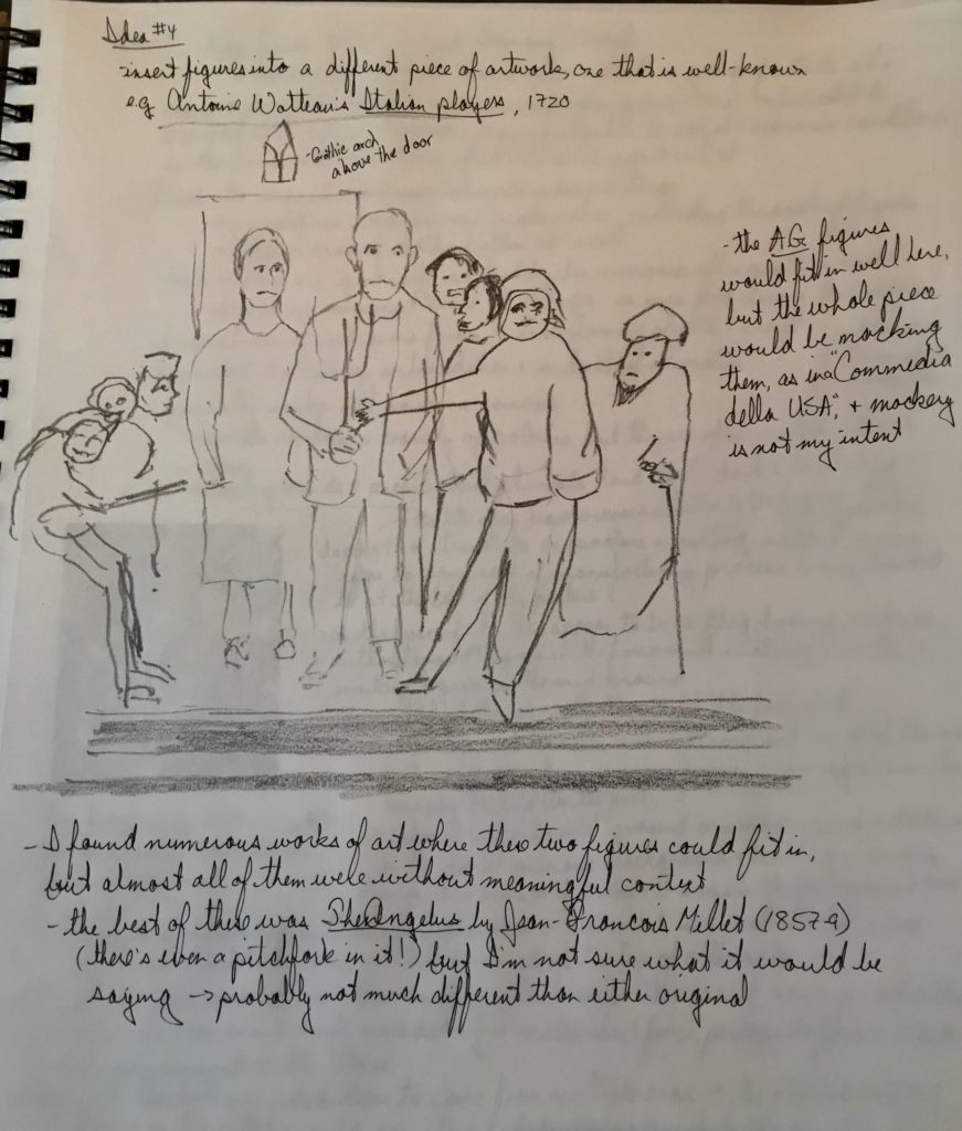
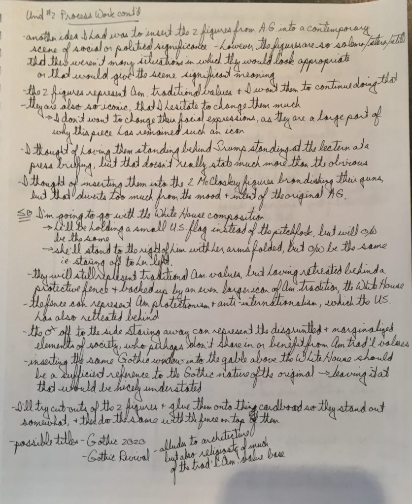
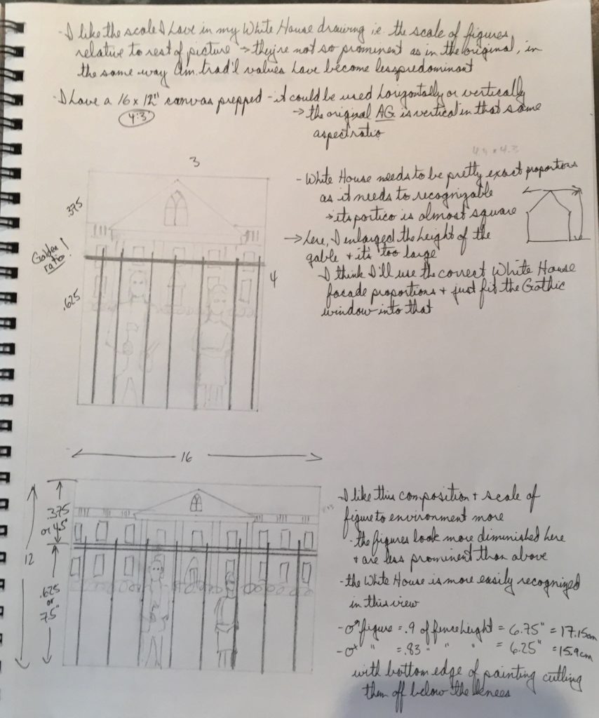
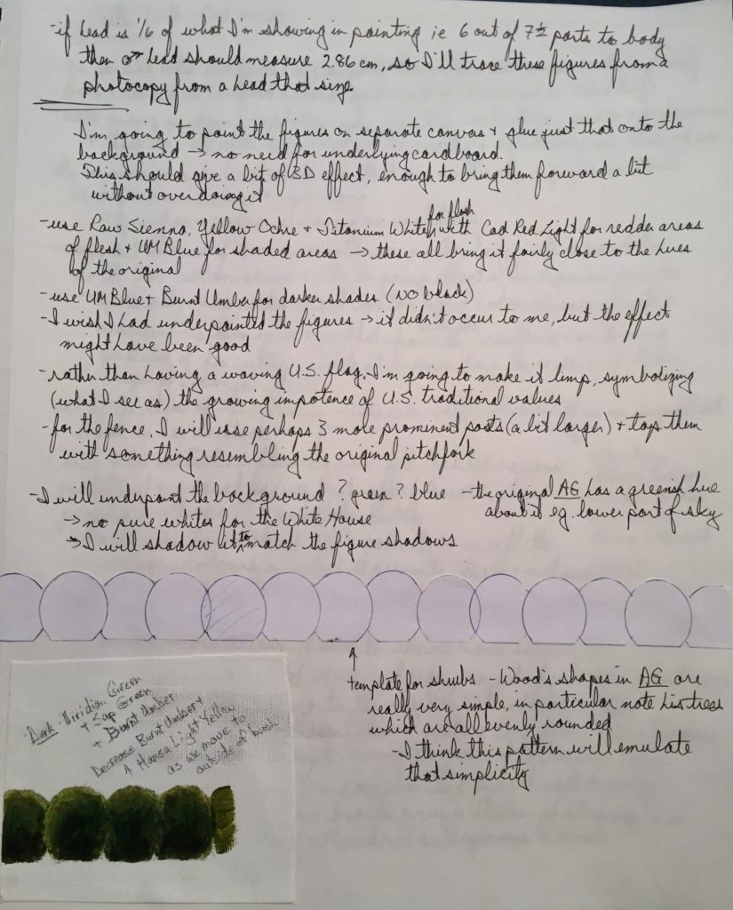
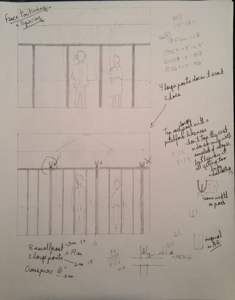
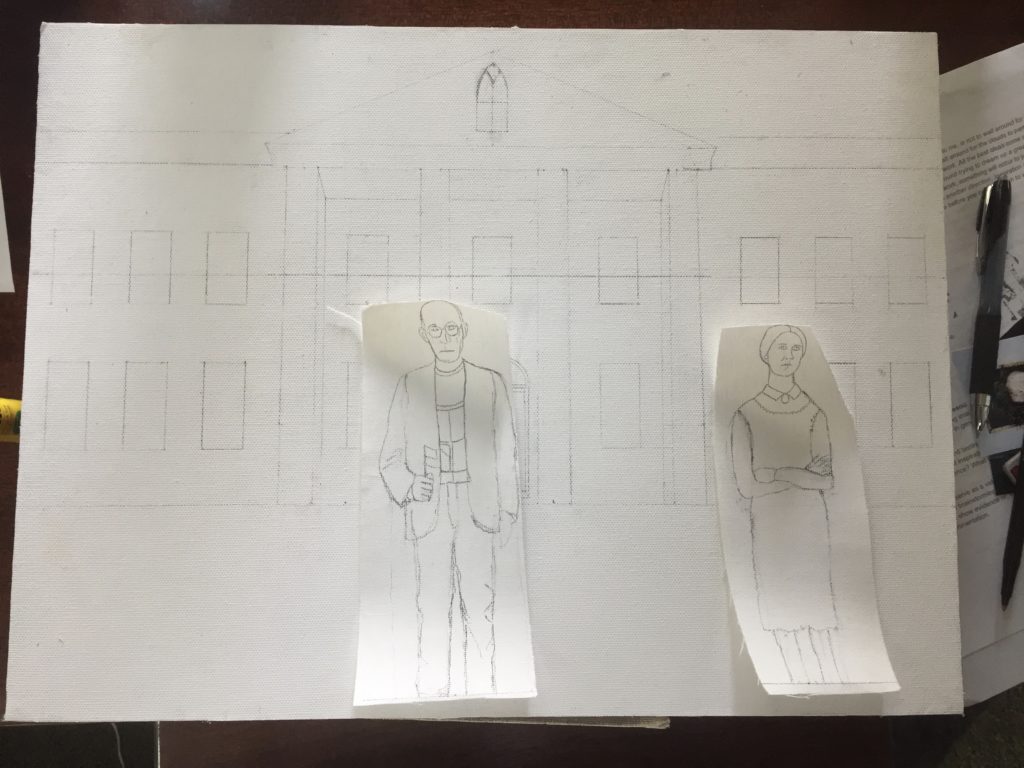
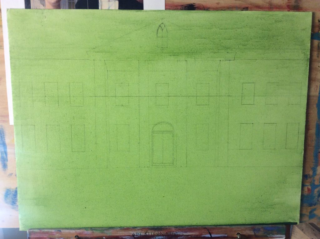
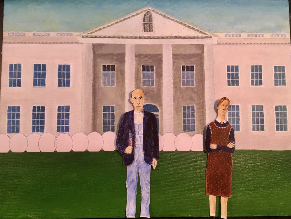
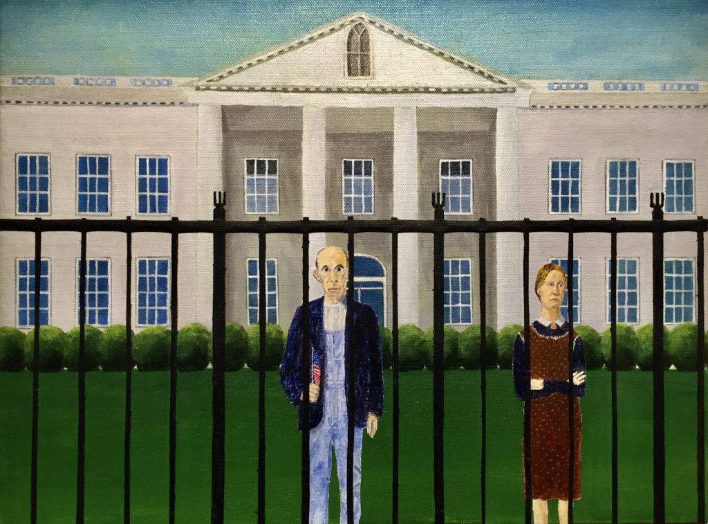
As was my original intention, I feel this work represents the change that traditional US values have undergone over the past 10-15 years. Although still quite evident and very influential, these values have experienced something of a diminishment and retreat. That is represented here by making the figures of much smaller size and prominence than what they were in the original painting and placing them behind the White House fence, as if isolated from much of the rest of American society. This painting could also speak to the more recent changes in the US position internationally as they have withdrawn from various organizations and isolated themselves. The moving of the female figure out from behind the man was meant to represent the disaffected elements of US society, looking dissatisfied and away, and wanting little to do with the male figure’s ‘celebration’ of the traditional values.
Technical considerations: In the end, I put in 4 fence posts between each of the larger ones. This worked better as a fence. You can’t really appreciate the 3D effect from the glued-on figures and fence here in this photograph, but with any angled light on it, small shadows are cast by these raised elements. I quite like that effect. I hadn’t planned on using any black paint, but there must have been some in the old dark blue paint I used to mix with the burnt umber. The black predominated and I don’t mind the effect anyway.
The male figure is just a bit off centre. His dome is repeated by the dome of the front door. Unintended and perhaps of no consequence.
By far, the most time painting was spent on the White House windows and decorative elements. It really gave me an appreciation for how much time Wood must have spent getting all that precise detail and the look of realism in the original.

