
Artist Research
SIGMAR POLKE (1941-2010)
-German painter and photographer who ‘came of age’ in the 1960’s
-the founder of the ‘Capitalist Realism’ style of painting with Gerhard Richter in 1963
-post-war West Germany’s answer to the influence of American and British pop art, as Germany sought to redefine its identity after the years of Nazism
-Polke appropriated the style of others’ work, and wasn’t above using the actual works of others
-parodies/commentaries on consumer society, post-war Germany, and classic artistic conventions -also parodied the ‘Socialist Realism’ style of art that had become so prevalent in the Soviet Union’s sphere of influence
-idiosyncratic and irreverent -used images and ideas that amused him, seemingly without much thought as to what the viewer might think
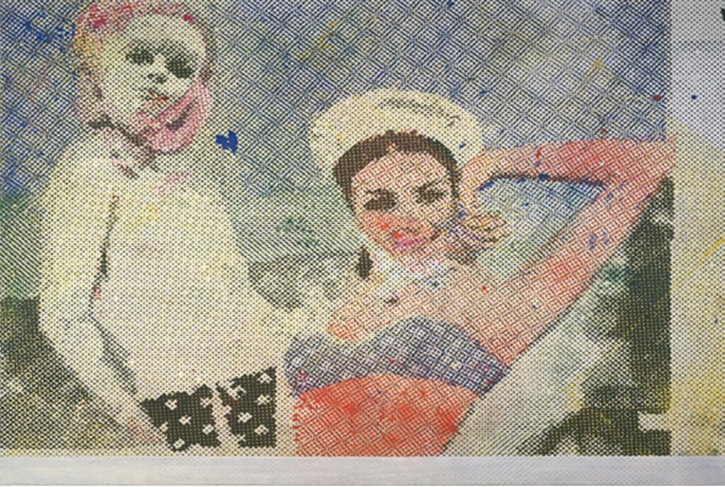
“Girlfriends” (1965/66). Offset lithograph, 47 x 59 cm. From moma.org
-my first impression is of a very pop art feel to it with the cartoon-like images and the dotted effect of commercial newsprint, not unlike what Andy Warhol and Roy Lichtenstein were producing at this time -the eyes are striking and my line of vision works back and forth between the two pairs of eyes, so it’s rather captivating that way
-the title seems appropriate; they look like they could be good friends -they look confident and both stare straight back at the viewer -in terms of the subject matter it is otherwise unremarkable
-there are some strong elements to the design, especially the contrast of the eyes, the linear movement of the bodies and arms around the work, and the overall composition, but you can’t credit Polke with these elements, as they are actually the work of the original photographer -what Polke contributed was the emphasis on the process, the dotted effect as we are familiar with in newsprint and comic books
-abstract elements in the background -the figures are representational, but with the dotted effect they are tending towards the abstract
Detail from “Girlfriends” (1965/66). From: Pinterest.com
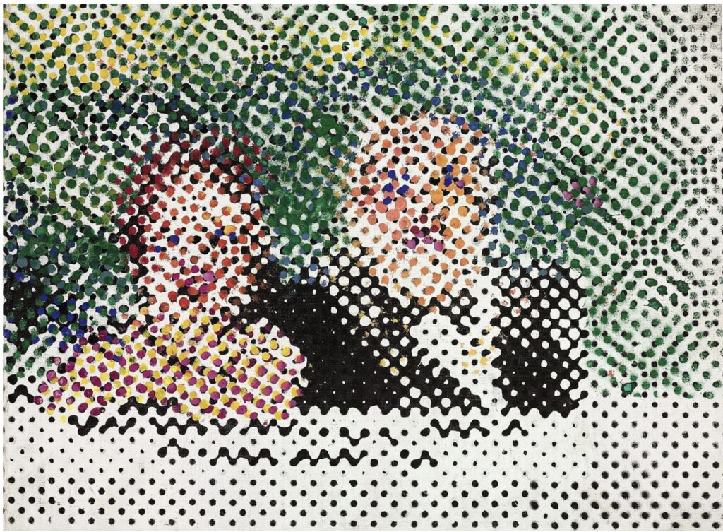
“The Couple” (1965). Oil on canvas, 40 x 53.6cm. From: Christies.com
-doesn’t have the pop art feel of the above painting, though I think it is Polke’s comment on the dotted effect of that genre -he’s taken it to an extreme, almost to the point that the two figures are unrecognizable; it’s very near to abstract, though the subject matter becomes clearer the further away from it you view it
-the title definitely helps the viewer, but doesn’t add much more than that. -they look dressed up, but there are not many other clues to the context
-perhaps this is the irreverent Polke, making the dotted effect the most prominent part of the painting, while the figures are hardly relevant -he did this using a pencil eraser to apply his paint
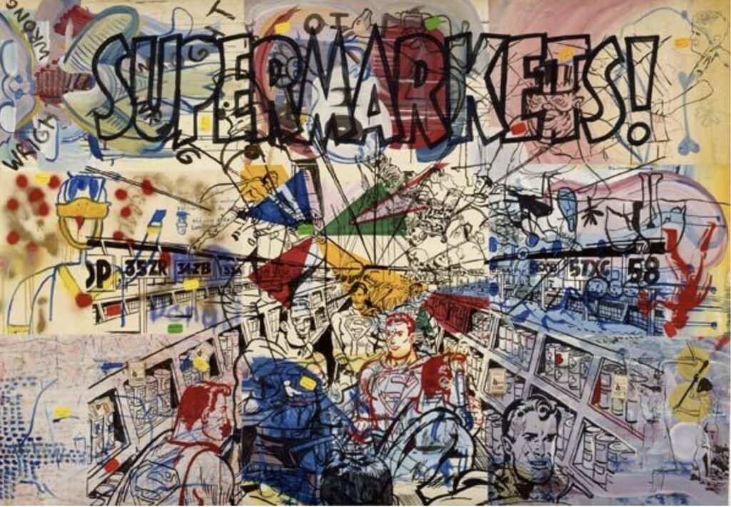
“Supermarkets” (1976). Gouache, acrylic, goldbronze, felt-tip pen, and paper collage on canvas, 207 x 295 cm. From: folksonomy.co
-this really feels like more traditional pop art with the multiple Supermans caught in various poses as they shop in the supermarket -lots of colour and numerous other figures filling the spaces around the painting
-it is a busy and chaotic composition, which gives this work a tension that I don’t really like -the busyness and tension are accentuated by the one point perspective, which draws you right in to the centre of the work -it feels then like you are trapped there and there is no escape
-perhaps this work is meant to show the capitalism to which Polke alludes in his ‘Capitalist Realism’ genre -Polke wasn’t against capitalism; he was quite in favour of it, his family having escaped from communist East Germany in 1953 to end up in West Germany -however, Polke is not above poking fun at the elements he thinks are deserving of such parody
-an interesting painting, but not one I enjoy viewing for very long
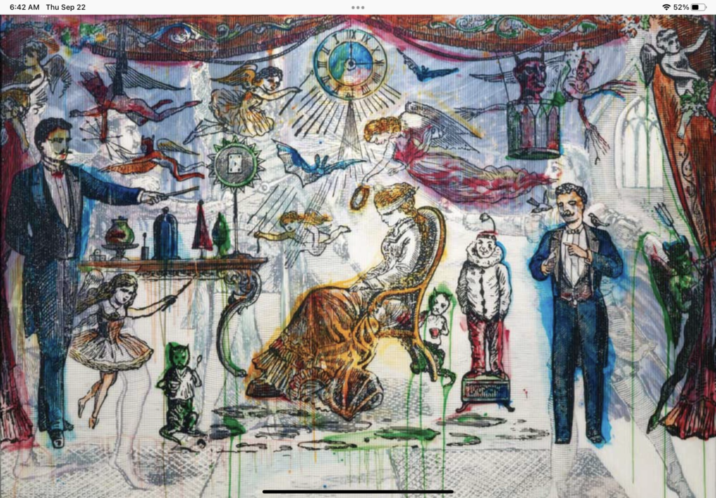
“The Illusionist” (2007). Mixed media on fabric, 220 x 300 cm. From: irequireart.com
-another full canvas, but the elements here are more discernible and easier to digest -that doesn’t mean I understood it any better, in fact I make less sense of what Polke’s point is here than in his other works -the illusionists and the blindfolded subject are straightforward enough, and the framing curtain suggests they are on a stage -but what of these various angels and devils, the elements of good and evil
-this work has an older, classical illustrative style about it with its fine and precise lines, while the upper parts suggest to me earlier Christian art -if you think of it as the older piece that Polke was trying to convey, then the good and bad elements seem more appropriate, as magic and illusion have been thought of as evil at times in the past
DAVID SALLE (b. 1952)
-an American artist in the Neo-expressionism and Postmodernism styles
-his works tend to marry traditional (and often appropriated e.g. Disney and pieces from art history) figures with his own original elements -many of his works consist of juxtaposed images of both abstract and human figure form
-Salle’s intent is to eliminate the narrative element in his works -he often starts with one image or figure and gradually adds others to it, cross-referencing them with one another in complex ways -his critics doubt he is as intentional as that; they have described Salle’s work as random and incoherent, as if he is putting various elements together with no real purpose in mind
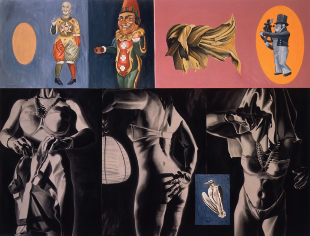
“Sextant in Dogtown” (1987). Oil & acrylic on canvas, 96 x 124 inches. From: davidsallestudio.net
-top row of clownish, male figures, two of them laughing or jeering, the third dressed in old naval garb, holding a sextant -these are juxtaposed with the three headless and barely dressed female figures in the bottom row -the black and white female drawings are starker and more realistic, suggestive of the trapped and perhaps coerced situations in which they find themselves
-the contrast between the two rows is striking, as if the male figures freely enjoy themselves, while the female figures are trapped in servitude
-if the sextant represents navigation, is Salle saying we have lost our way and need better direction
-I don’t understand the knotted element to the left of the sextant nor the bird inset in the row of female figures
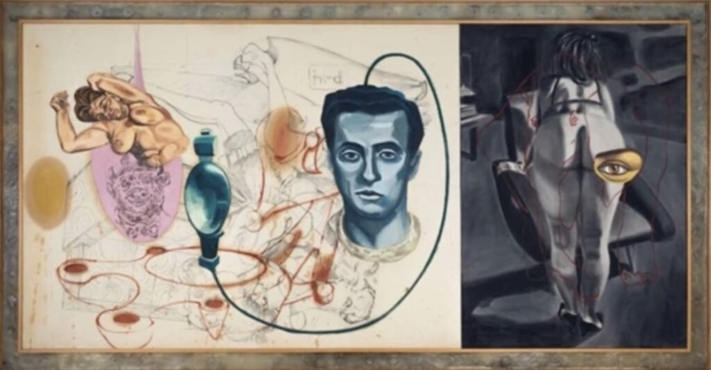
“The Flagrant Eyeball” (1987). Acrylic, charcoal &oil on canvas, 60 x 114 inches. From: mutualart.com
-this work is more straightforward -the male brain is hardwired to the sexual objectification of women and the consumption of these images -this man looks mesmerized, as if in an automaton-like state -he’s captivated and can’t stop looking at these images, thus presumably the title for this work
-again, you have a coloured panel juxtaposed with the black and white female image, which in this case is overlaid with sexual drawings and the flagrant eyeball
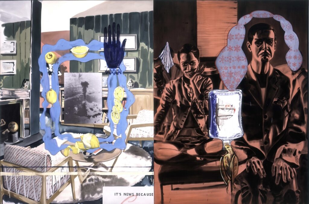
“Tragedy” (1995). Oil & acrylic on two canvas panels, 96 x 144 inches. From: the broad.org
-I had much less success getting any understanding of what Salle is trying to do here -the figure on the right in his two different poses appears to be experiencing some sort of medical ‘tragedy’, as suggested by his saddened expression and the IV bag -the more colourful panel on the left is focussed on a photo of a large bomb going off, a tragedy in itself, but how does this relate to the surrounding lemons and the furnished rooms
-is the man in the right panel’s situation a result of the perhaps atomic explosion on the left? -numerous images, objects and elements here that I don’t understand -maybe his critics have a point

“Verdi with Blue Background” (2020). Archival pigment ink on fine art paper, 58 x 42 inches. From: artnet.com
-from a recent series of portraits done by Salle
-so much conveyed with such simple lines and different value areas -not much attempt at gradual transitioning between the value shapes
-a very effective portrait -somewhat cartoon-like, perhaps suggestive of pop art, but I think it stands on its own as an effective portrait
Technique Exploration


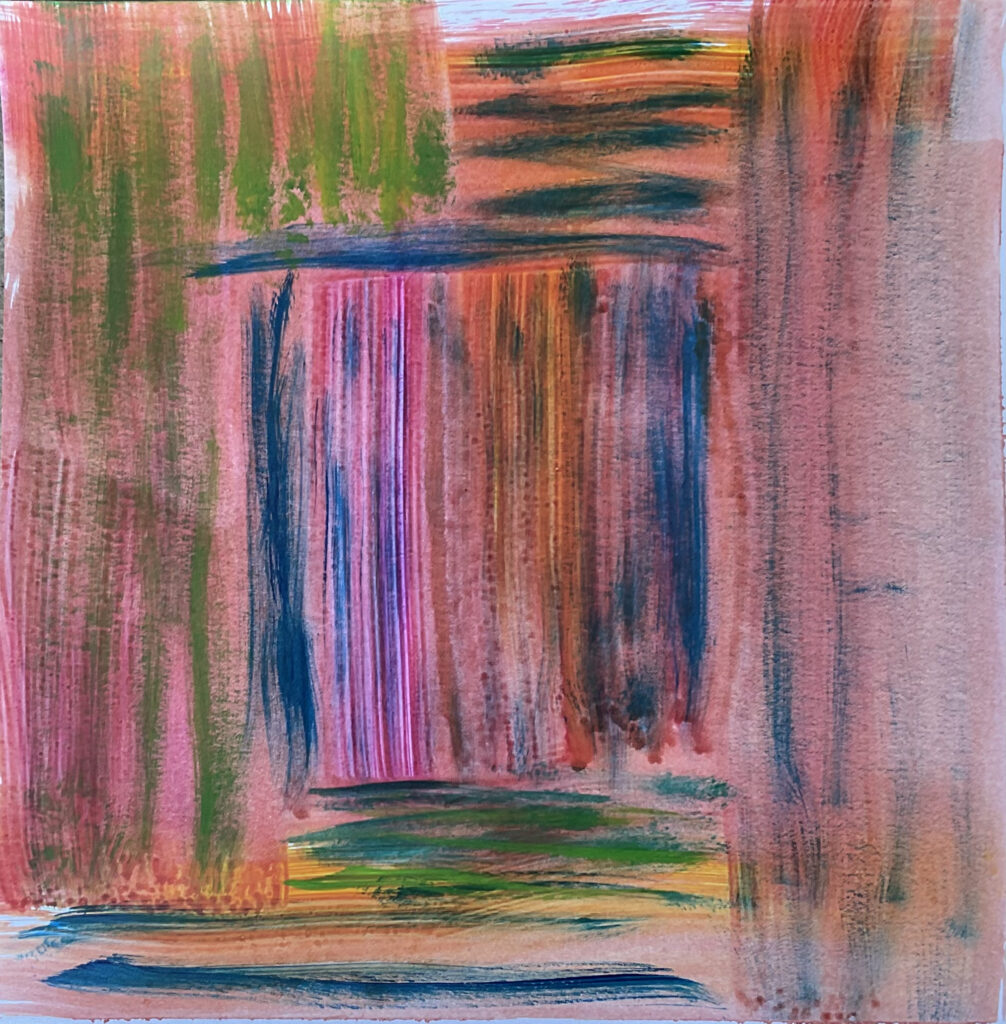
Background- wet wash on wet for gradation.
Scumbling for trees. String in paint bottom right. Glaze used to affix paper punched fruit in tree. Glaze could used to affix almost anything.

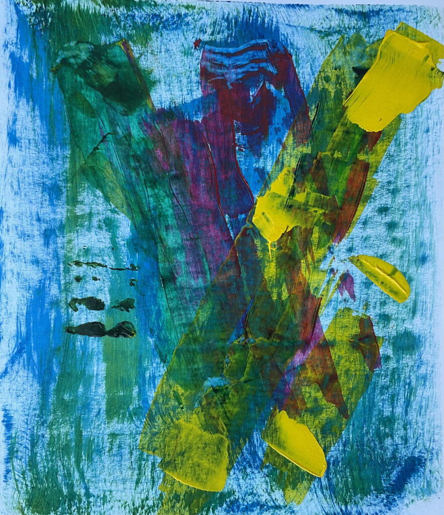
Stippling applied with pencil eraser and paint brush comb. Circles applied with bottle lid.

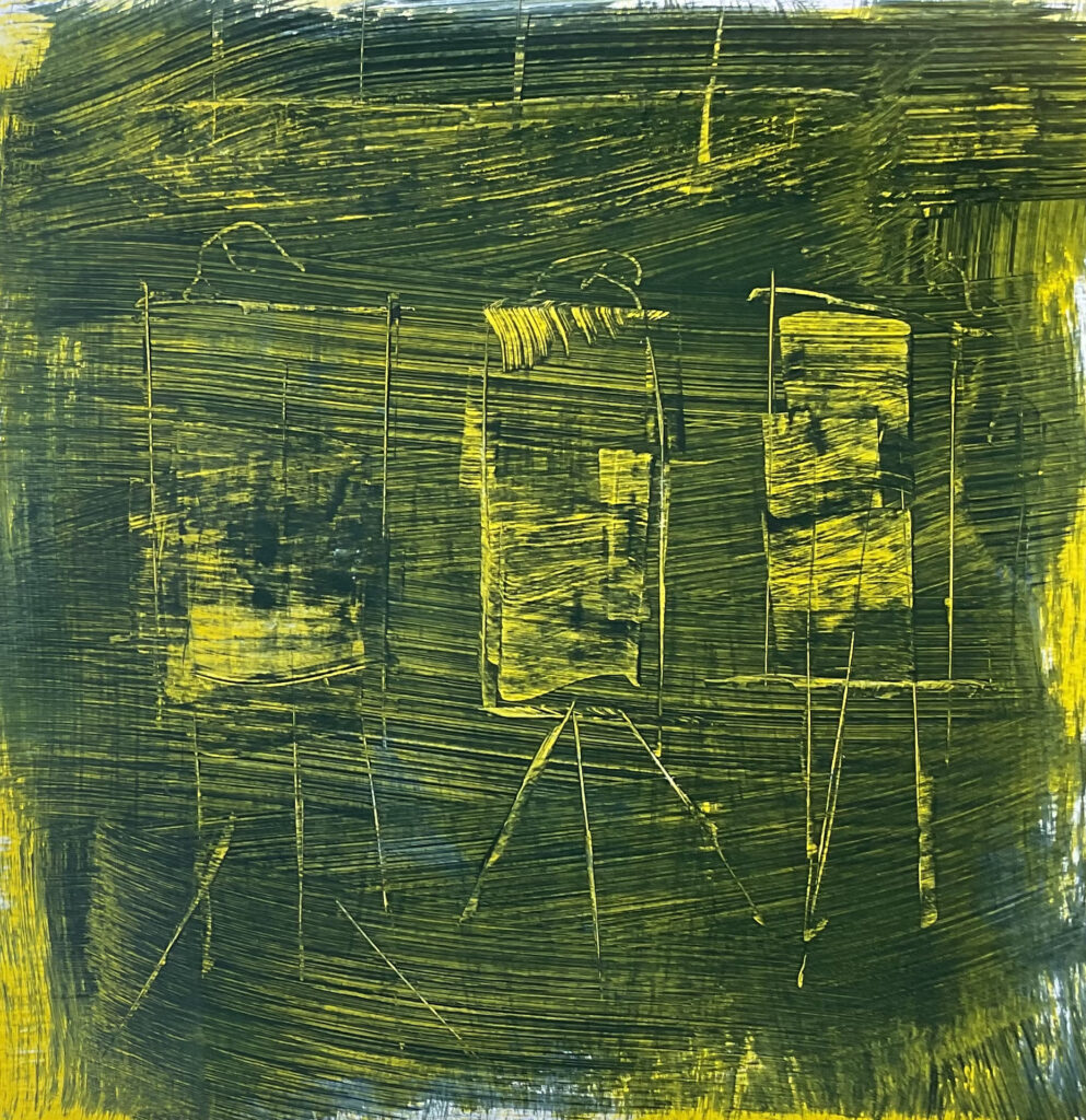
Sgraffito- cadmium red medium underpainting with Payne’s grey on top, palette knife and drywall scraper as tools, Hansa yellow medium applied to some sgraffito areas after drying. Note how wiped off yellow paint shows up in the brush strokes of underlying top coat.

Various sgraffito methods to a very thick top coat, then different paints applied to the sgraffito areas once dry and wiped clean to see if paint would remain in the depressions formed by the sgraffito. Note fern-like effect in top right hand corner from dragging sgraffito tool through topcoat that had already started to dry.

Stippling applied with pencil eraser.
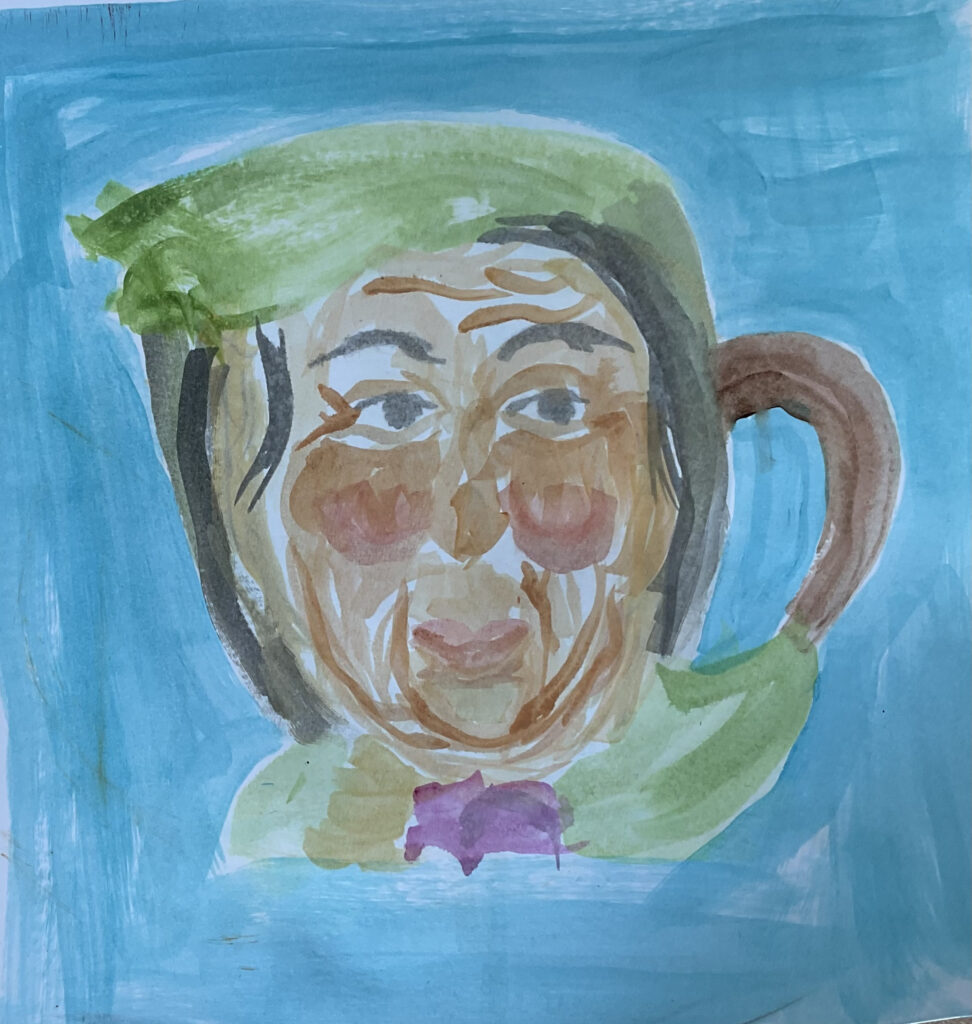
Wet wash painting of same mug as above. Numerous clear gloss glaze coats applied to just the mug, but it didn’t seem to change the effect at all.
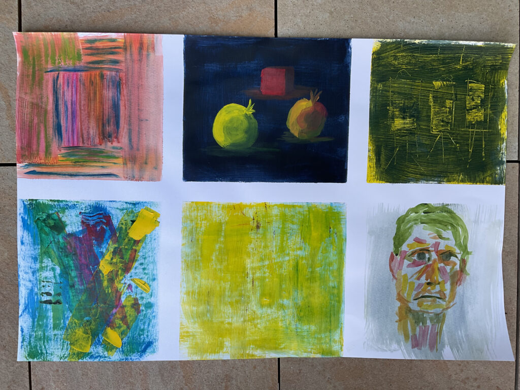
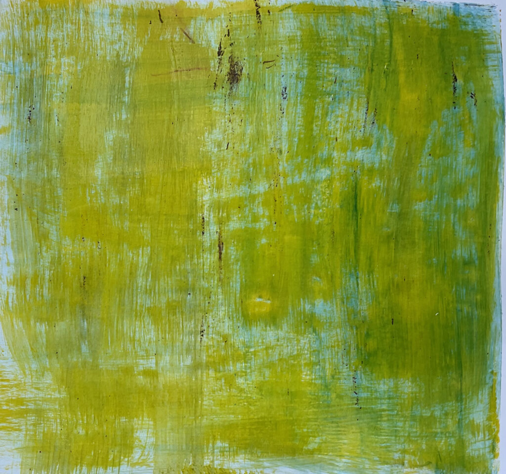
Dry brushing.

High contrast background to objects.
Sgraffito drawing.
Applied with drywall scraper. Some impasto effect.
Green glaze applied to right hand side, also picked up some nearly dry darker paint with the initial yellow dry brushing.

Wet wash self-portrait.
Painting #1 – “Scraper additive” – Some background brushed underpainting, but everything else was applied by scraper or palette knife.

Painting #2- “Scraper subtractive” – Payne’s grey underpainting, cadmium red medium and extender top coat. All marks made with a variety of scrapers and palette knives, and a pen cap for the irises.
Analysis of Style Painting

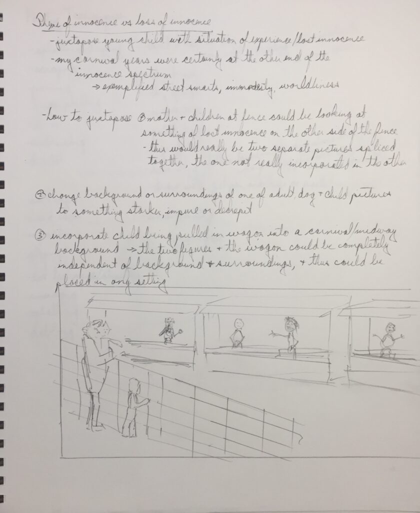


Composition and perspective drawings.


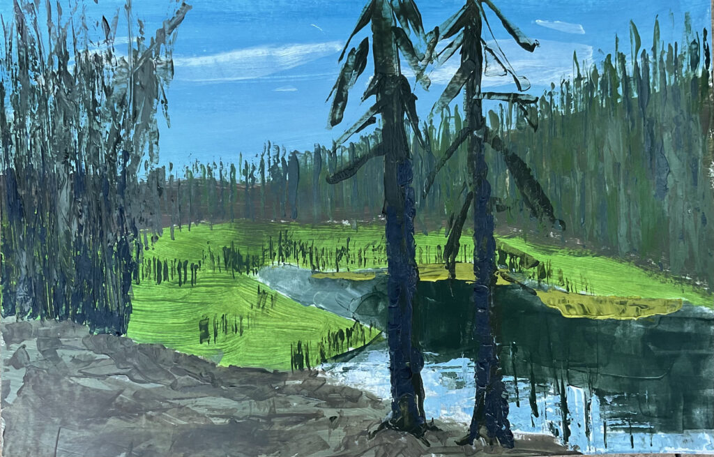
Submitted for critique. Chiaroscuro effect didn’t work out as I anticipated. Some differentiation between light and dark areas, but this was more a result of saturation levels rather than true dark and light.
Techniques used: scraping/sgraffito down to different coloured underpainting, sponging, lots of dry brushing and scumbling, black lines applied by scraper, glazing with darker hues to darken some of the non-foreground parts.
I’m pleased I got this done in the limited time I used. I’m becoming more comfortable letting ‘impressions’ of objects stand rather than worrying about finely detailing down to a more realistic appearance. Five figures was a lot, but they came fairly easily. Many details I didn’t attend to that would have improved the painting, but I had spent enough time on it already.
After critique with some adjustments made. I don’t think this painting excited anyone but me. (That includes family members, which is never a good sign for me.) I’m sure this reflects the very personal nature of the painting and its underlying emotions. Is it my goal to excite others with my painting? Maybe not, but it is rewarding when it happens. Nonetheless, I can feel the progress I’m making.
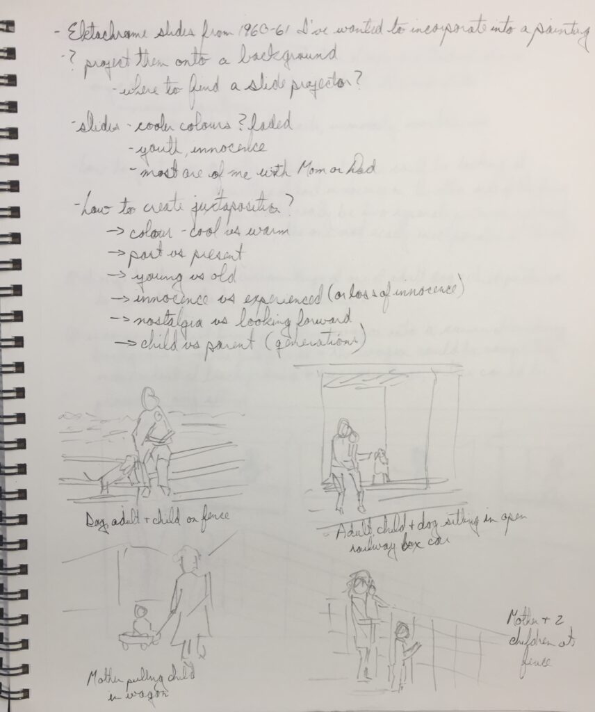
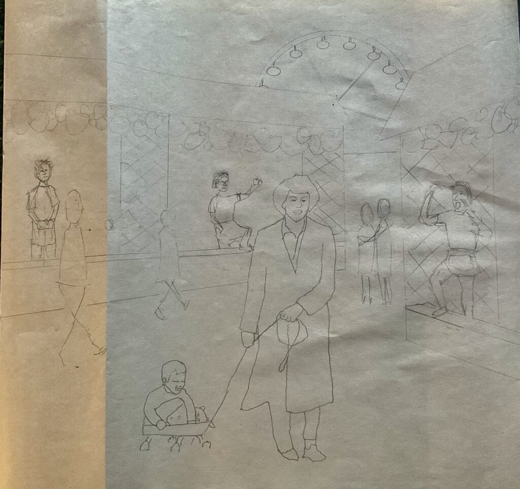
I like the slide projection aspect of this and would use it again, but I’m the only one who saw it used, so I don’t think the significance of it is appreciated by anyone but me. Again, quite personal and not something that is going to be noted by the average viewer.